I keep forgetting which package to install in Ubuntu to get the DTDs for html, to stop xsltproc from hanging forever. So, for posterity: w3c-sgml-lib. I think it was w3c-dtd-xhtml in Ubuntu 16 and older.
Tag: HTML
Having spent ten yours out of the loop, I had somehow expected browser makers to take some time out of their favorite hobby—moving knobs and settings around—to implement CSS printing support. I’m all for saving paper and all, but requiring me to pipe my HTML through LaTeX to produce halfway decent documents doesn’t feel very 2017ish to me. In 2007, it already didn’t even feel very 2007is to me.
I’m trying to make the articles on www.sapiensthabitat.com nicely printable. The good news is that I can finally style my headings so that they do not end up all alone on the bottom of a page. page-break-after: avoid is finally supported, except that it isn’t in Firefox. Well, I’m still happy. Back in 2007, only Opera supported this.
Next stop: I wanted to replace the standard header and footer slapped on the page with something nicer. It turned out that, yes, @page {} is supported now, which makes this rather easy:
@page {
 : 0;
}
Except, then I wanted to add the page number, preferrable in the form n/N to the footer, which turned out to be impossible.
Then, I thought: since my publication pipeline starts with Markdown, I might as well convert that to PDF through LaTeX and then hint to the browser to use the PDF version for printing:
<link rel="alternate" media="print" type="application/pdf" href="print.pdf" />
Never mind. Why did I even for one second think that this would be supported?
Stichting EcoSafe is a Dutch foundation for the safe-keeping of the funds that are necessary for the maintenance of hardwood plantations. In July of 2006, together with Johan Ockels, I created a website for the Foundation. Johan was responsible for the organization of the whole process. This went very smooth and the website ended up being an emblem of simplicity and clarity. That’s why I wanted to blog a bit about it now, even though there are a few things that I’d probably end up doing different if I were to start from scratch. [There’s actually a disturbing number of things for which this is true, I’m coming to notice.]
 The Welcome page of the EcoSafe website |
 EcoSafe page for plantations |
 EcoSafe cost structure |
File structure
Like with most websites, I started with creating an SVN repo so that I wouldn’t have to be afraid of ever losing anything.
The file structure was pretty standard:
- a css dir for stylesheets;
- img for images;
- inc for shared PHP and mod_include stuff and for AJAX partials;
- jot for to-do’s and other notes;
- and js for JavaScript files and libraries.
Possible file structure improvements
If I were to redesign this file structure, I’d collapse css, img and js into one directory called layout, because these are typically things that require the same robots.txt and caching policy. Also, it is meaningless to organize things by file extension. If you want to sort something by file extension, use ls -X
(or ls --sort=extension
if you’re on GNU).
Server-side includes
The site would be so simple that I felt that any type of CMS or content transformation would be completely unnecessary. Instead, I decided to rely on Apache’s mod_include and just use a few partials for repeating page elements such as the left sidebar containing the logo and the menu.
Also, because I didn’t need to transform the HTML files, I decided I could use good ol’ HTML 4 instead of XHTML 1 (which I’d have to send to the browser with the wrong mime-type anyway).
This is the HTML for contact.nl.shtml:
<!DOCTYPE html PUBLIC "-//W3C//DTD HTML 4.01//EN" "http://www.w3.org/TR/html4/loose.dtd">

<html lang="en">
  <head>
    <title>Contact EcoSafe</title>

    <meta http-equiv="Content-Type" content="text/html; charset=UTF-8" />

    <link rel="stylesheet" type="text/css" href="/css/style.css"></link>
  </head>

  <body>
    <!--#include virtual="/inc/left-side.en.html"-->

    <!--#include virtual="/inc/alt-lang.phtml"-->

    <div id="content">
      <h1>Contact</h1>

      <p>Your email to EcoSafe kan be sent to the following address:
      <a href="mailto:service@stichting-ecosafe.org">service@stichting-ecosafe.org</a>.
      Or, alternatively, you can fax us at +31 50 - 309 66 58.</p>

      <h2>About this website</h2>

      <p>For comments and/or suggestions concerning this website,
      you can direct an email message at:
      <a href="mailto:webmaster@stichting-ecosafe.org">webmaster@stichting-ecosafe.org</a>.</p>
    </div>
  </body>
</html>
Alternative language selection
I use <!--#include virtual--> to include the repeating parts. <!--#include virtual--> has several advantages over <!--#include file--> in that it allows for content-negotiation, execution of dynamic content etc., but here the only place were it holds an advantage is in the inclusion of /inc/alt-lang.phtml. alt-lang.phtml is a messy PHP script that figures out which language variants of a page are available and displays a selection of alternative language versions (variants with a language different from the current).
SSI and caching
Without the XBitHack directive set to full, all content handled by mod_include is sent without a Last-Modified header. However, I don’t want to use XBitHack at all, because I don’t want just any executable file to be handled by mod_include; that just too much of a … hack.
If I were to do something similar now, I’d use some kind of (sed) substitution to pre-process the includes locally so that more of what I end up uploading is simple static content. The dynamic part of the included PHP script, I would simply replace with JavaScript.
Visual design
As you can see in the HTML example, there’s hardly anything layout oriented in the HTML source. This is good, and means that I have to touch only the CSS for most minor and major lay-out modifications. (It is a pipe-dream to think that you only need to change the CSS to make the same HTML page look however you want as long as that HTML is rich enough in meaning, but for a site with pages of such simple structure, it’s a dream that comes pretty close to reality.)
I’m not much of a designer, but I think design is overrated anyway. Actually, I think that most website suffer from too much design.
The EcoSafe logo
To start the design, I got a logo made by Huite Zijlstra. Because the logo was pretty big and didn’t look good scaled down, I decided to put it at the left of the content area instead of at the top. This would still leave enough room for the menu (which actually takes less space horizontally than the logo).
Colors
For the color scheme, I just picked a few colors from the logo. As always, the base of the scheme would be black text on a white background for maximum readability. The print version hardly uses any colors.
@media screen {
body            {:;  }
*               {:;             }
a:link          {: #585;              }
h1              {: #880;              }
h2              {: #888;              }
strong          {: #a62;              }
#menu li a      {: #660;              }
}
Underlines
I wanted an underline below the level 1 and 2 headings. Because I didn’t like the effect of text-decoration:underline (too thick for <h2>s, too dark for <h1>s and different from browser to browser) and because border-bottom was set too far from the text, I made two simple PNG images that I could repeat-x along the bottom edge.
@media screen {
h1 {:('/img/h1-border-bottom.png'); }
h2 {:('/img/hx-border-bottom.png'); }
}
Menu
The menu is very simple. The markup is part of inc/left-side.en.html for the English version and inc/left-side.nl.html for the Dutch version:
cat inc/left-side.en.html
<div id="left" lang="en">
  <a class="logo" href="/index.en"><img class="logo" alt="[Logo]" src="/img/logo.jpg"></img></a>

  <ul id="menu" class="menu">
    <li><a href="/index.en" rel="start">Start page</a></li>
    <li><a href="/plantations.en">For plantations</a></li>
    <li><a href="/investors.en">For investors</a></li>
    <li><a href="/history.en">History</a></li>
    <!--<li><a href="/goals">Goals</a></li>-->
    <li><a href="/methods.en">How it works</a></li>
    <li><a href="/cost-structure.en">Cost structure</a></li>
    <li><a href="/cost-calculator.en">Cost calculator</a></li>
    <!--<li><a href="/clients.en">Clients</a></li>-->
    <li><a href="/contact.en">Contact</a></li>
  </ul>
</div>

<script type="text/javascript" src="/js/menu.js"></script>

The EcoSafe menu (in English)
As is customary, I started by removing all the default list styles and made the anchors behave as block-level elements. I used the big O from the logo for bullets in the list (using background-image instead of list-style-image because the latter gives unpredictable cross-browser results and doesn’t make the bullet clickable).
#menu {
 : 2em;
 : 2em;
 :;
 : 0;
}

#menu li {
 : 0;
}

#menu li a {
 :;
 :('/img/o-21x16.png');
 :;
 :;
 : 30px;
 :;
 :;
 :;
 : #660;
}

#menu li a:hover,
#menu li.active a {
 :('/img/oSafe-21x16.png');
}

#menu a:hover {
 : #787800;
}
JavaScript menu item activation
To add the active class to the currently active list item (<li>), I used a client-side solution using JavaScript. After all, it’s proper use of JavaScript to enhance your user interface with it (as long as, as many would say, it isn’t required for the UI to function (as it is in the Cost Calculator)).
// menu.js

var menu = document.getElementById('menu');
var anchors = menu.getElementsByTagName('a');
var locationHref = window.location.pathname.toString();

for (i = anchors.length - 1; i >= 0; i--) {
  a = anchors[i];
  aHref = a.href;

  // Does this menu item link to the current page?
  // We find out by looking if the window location contains the URL in the anchor
  // or the other way arround. The reason to look at both is content-negotiation.
  // It's also true if the location is just '/' and we're looking at the anchor of
  // the 'start' page.
  if ( (locationHref === '/' && a.rel === 'start') ||
       (locationHref !== '/' && ( locationHref.indexOf(aHref) !== -1 ||
                                  aHref.indexOf(locationHref) !== -1 ) ) ) {
    a.parentNode.className = 'active';
    break;
  }
}
I actually just fixed a long-standing bug that was caused by me not being able to fully rely on HTTP language negotiation for the selection of the appropriate language variant, which made me change all links from being language-neutral to including the language in the link target (e.g.: http:///history became http:///history.en and http:///history.nl), the problem with this being that, instead of being able to link to link to http:/// (http://www.stichting-ecosafe.org/), I had to link to http:///index.en or http:///index.nl, making it more difficult to detect the active anchor if we’re requesting the home page through http:/// instead of on of its language-specific URLs.
The JavaScript rested on the assumption that by reverse iterating through all the anchors in the menu and thus processing the link to http:/// as last, I’d know that I had struck the home page and wouldn’t need to worry that any of the links contain a slash. (I don’t know if I intended it to work this way, but it sure seems to me now that the only way this could ever have worked was as an apparent side-effect of the looping order; the SVN logs seem to agree.)
I could have solved this by redirecting all requests for http:/// to the appropriate variant. Maybe I should have (to avoid duplicate content). Instead I chose to add a rel="start" attribute to the links to the home page, as can be deduced from the JavaScript above. (To resolve the duplicate content issue, I could also add a canonical link to the header of the two language variants.)
Anyway, all this brings me to the messy subject of content negotiation.
Content and language negotiation
The EcoSafe website would be bi-lingual (English and Dutch) from the onset. Initially, I wanted to use language negotiation to the extend of having completely language-neutral URLs. For example: http:///cost-calculator
instead of http:///cost-calculator.en
and http:///cost-calculator.nl
. In the end, you can make this work properly in the browser with the help of a cookie, but it’s still a pipe-dream because nothing else will work if you do not also offer another navigational path to the different variants. Maybe, we’ll revisit this topic for a later experiment.
Content-type negotiation is almost effortless with Apache thanks to mod_negotiation. If, like me, you despise to have .html, .htm, .xhtml, .phtml, .pxhtml. .sxhtml, .php, .xml in your URL (I actually used all of these at some time or other), you only have to make sure that MultiViews is in your options.
I’ve configured SSI by means of the following instead of a “magic mime-type”:
AddType         text/html       .shtml
AddHandler      server-parsed   .shtml
AddCharset      UTF-8           .shtml
AddOutputFilter Includes        .shtml
For PHP I couldn’t do the same because my web host was still at Apache 1.3. Otherwise, the following should have worked equally well for PHP:
# This doesn't work with Apache 1.3
AddType        text/html       .phtml
AddHandler     php-script      .phtml
AddCharset     UTF-8           .phtml
Configuring language priority is easy with Apache:
Integrating PHP and SSI
The integration of PHP with all the weirdness that I had configured and created around SSI took some figuring out. Luckily, PHP offers a virtual() function that works roughly the same as mod_include's <!--#include virtual-->. Here’s an example:
<body>
  <?php virtual('/inc/left-side.en.html'); ?>
  <?php $uri = '/cost-calculator.en.phtml'; include('inc/alt-lang.phtml'); ?>
In retrospect, it’s pretty much bullshit to use it. I could have just as well require()d the partials (which I actually did for the alternate language selection), but I probably started out using virtual on a more generic URL without language and content-type selection in it.
406 handling
Because I deployed on Apache 1.3 and the ForceLanguagePriority directive was only introduced with Apache 2.0.30, I had to write an ugly hack to avoid visitors getting 406 errors. To that end, I added a 406 handler to my .htaccess file:
LanguagePriority en nl
ForceLanguagePriority Prefer Fallback # This doesn't work with 1.3

ErrorDocument 406 /error-406.php # Luckily, this does
error-406.php is a PHP file that figures out the available variants based on $_SERVER['REQUEST_URI']. Then, it simply picks the first one (which works because, accidentally, that’s the one I’ve given priority using the LanguagePriority directive as well), outputs a 200 OK header instead of the 406, and virtual()s the file of the variant. The code looks somewhat like this:
<?php
chdir($_SERVER['DOCUMENT_ROOT']);
$filenames = glob(basename($_SERVER['REQUEST_URI']) . ".*");

$filename = $filenames[0];

apache_setenv('DOCUMENT_URI', "/$filename");

header('HTTP/1.1 200 OK');
virtual("$filename");

EcoSafe Cost Calculator

EcoSafe Cost Calculator results
The Cost Calculator
The EcoSafe Cost Calculator is some of the least neatly contained and most procedurally oriented PHP code I’ve ever produced while knowing full well what I was doing. It does almost everything it does in global scope. Yet, it does it well.
The thing is designed as a dynamic web page rather than a web application. What I mean by this is that it’s simply two pages (one for English and one for Dutch) using PHP among a number of pages using SSI. In an application, it’s usual to have just one ‘view’ that is the same for all languages, but here I chose to put the different language versions in different language pages and then include everything reusable (and language-neutral) from within these files.
Most of the actual processing and calculating is done in inc/costs-functions.php. (The part about gotos is a joke. (Labeled blocks would have been quite sufficient. 😉 ))
<?php # costs-functions.php - Stuff that's includes by cost-calculator.{nl,en}.phtml
/**
 * Just remember that this code was never meant to be general purpose or anything.
 * So, relaxeeee and keep your OO-axe burried where it belongs.
 * Oh, if only PHP would support GOTO's ... Sigh ...
 */
The rest of the file is just a whole lot of processing of form data and turning it into something that can be easily traversed for display to the user. There are even the function calls without arguments doing all their work on globals. These are actually only added to make it clearer em a piece of code is doing. And—I must say—after a few years it’s still remarkably clear to me what each part of the code is doing. There’s no deep, confusing nesting structures or anything. There’s just a whole lot of very simple code.
Some simple AHAH increases form interactivity
Users of the calculator can add any number of plantings and locations. When the user decides to add a planting or a location, the onClick event triggers the execution of addExtraPlanting() or addExtraLocation(). Here’s how addExtraPlanting() looks:
function addExtraPlanting() {
  lang = document.documentElement.lang;

  new Ajax.Updater(
    'plantings', '/inc/planting.' + lang, {
      method: 'get',
      insertion: Insertion.Bottom
    }
  );
}
Ajax.Updater comes from the Prototype JavaScript framework.
Here’s what inc/planting.en.phtml looks like. The same file is also included in a loop to rebuild the form’s state after submitting.
<li>
  <input name="num_hectares[]" type="text" size="5" value="<?php echo $num_hectares ?>" />

  hectares have been planted in

  <select name="plant_years[]"><?php require('planting_options.php') ?></select>

  (<a title="Remove this planting" href="#" onclick="removePlanting(this); return false;">x</a>)
</li>
I think that I’ve gone into small enough detail by now to get to the conclusion. Also showing the contents of planting_options.php would be pushing it. Ah, well…
<?php

if ( !isset($this_year) ) $this_year = intval(date('Y'));
if ( !isset($plant_year) ) $plant_year = $this_year;

for ($i = $this_year; $i >= $this_year - 20; $i--)
  echo "<option" . ($i == $plant_year ? " selected='1'" : "") . ">$i</option>\n";
(Yesterday, I couldn’t resist the temptation of turning this into a simple file to require() instead of the function definition it was. I think it’s funny to refactor something to remove encapsulation.)
Conclusion
As is usual when looking at old code, I see many things that I’d do (even just a little) different today, but I saw a surprising number of solutions that I actually still like now that I see them back after three years. Removing some of the remaining warts probably won’t do much good besides the masturbatory satisfaction it could give me. (It’s likely that the website won’t live much longer, making such extra attention very undeserved.) But, nevertheless, I’ve enjoyed blogging about it now to recoup the whole experience and to at least look at what I’d do different now and what I learned in the meantime.
Some links
I was transcribing a draft for a manuscript. Using VIM, of course. But, I found my VIM skills to be lacking somewhat, enough to become sufficiently annoyed to investigate the holes.
Word wrapping
The first thing that I wanted to learn to remember was how to control word wrapping and, especially, how to rewrap text.
I had noticed already that on my current machine, VIM enables word wrapping by default for .txt files. I liked this, except I had forgotten long ago (or never properly remembered) how to rewrap lines. This can be done with gq. gq operates on the current selection or on the argument (a number of words/characters/sentences/paragraphs/etc).
Soon, I decided to turn my .txt into a simple TeX file (to be able to add annotations using TeX comments). This disabled the word wrapping, so I had to find the setting to control this. There's actually two settings:
- wrapmargin defines how close the text may approach the right edge of the VIM window before it starts wrapping,
- whereas textwidth tells VIM to start wrapping when a fixed number of characters is approached.
Because VIM doesn't do wrapping by default for .tex files, I added the following modeline to the bottom of my draft:
% vim: set textwidth=80 spelllang=nl:
Note that I find 80 characters way too small for most programming tasks, but very convenient as a width for reading prose from a screen. On occasion, I've even used width: 80ex; in the CSS of a website.
Sentences and paragraphs
A few movement commands that I've never used enough to remember well are {/} and (/). } and { are used to move a paragraph forward or backward, respectively;) and ( are used to move a whole sentence forward or backward. This is particularly useful while editing prose.
To quickly select a paragraph, for example, you can easily move to the beginning of the paragraph using {, press v to start a selection and go to the end of the paragraph with } (or type 2} to also select the next).
If you want to delete a sentence, go to the start of the sentence (using either ( or )) and type d). It’s as easy as that.
If deleting the sentence fucked up the formatting of your paragraph, reformat by going to the beginning of the paragraph and typing gq}.
Proper punctuation and other special characters
TeX offers a method to construct special characters using plain ASCII source files. In the past, in my inability to properly configure everything for UTF-8, I’ve often made use of this. In TeX, \'e will be turned into é, \"i into ï, etc. This can be convenient, but it’s much more convenient to have an environment that’s properly configured for UTF-8. To enter special characters on my US keyboard layout (standard in The Netherlands), I’ve added compose:ralt to my XKB options. Using this option I can press Right Alt followed by a punctuation character, followed by a character to combine it with.
Clearly, constructing special characters on the level of X holds many advantages over having to do this differently for each and every application. This way I can also type in ë in this HTML <textarea> instead of having to type ë. (In HTML, it’s actually better to use a numeric character reference, such as ë instead of ë, because that doesn’t require the loading of the DTD, but that’s another rant altogether.)
If you don’t have an accommodating XKB configuration, it’s still possible to enter the characters directly at the VIM level. In VIM, :help digraph (see also the on-line HTML version) tells you everything about it. In short, use Control+K followed by a punctuation character, followed by a character to compose special characters in a way similar to X.
What’s very nice about VIM’s default setup is that it allows you to also easily create proper opening and closing single and double quotes. In TeX these are traditionally done using combinations of back-ticks (`) and apostrophes ('). TeX’s default behavior can be problematic, a good reason to switch to Unicode.
| char. | VIM digraph | TeX |
|---|---|---|
| “ | Ctrl+K, ", 6 | `` |
| ” | Ctrl+K, ", 9 | '' |
| ‘ | Ctrl+K, ', 6 | ` |
| ’ | Ctrl+K, ', 9 | ' |
Something else that becomes very easy with VIM’s digraphs is entering proper punctuation characters, such as em/en dashes. These are done by following Ctrl+K with a hyphen and a capital N or M. In TeX these could already be done by simply entering two or three hyphens, but if you prefer it that way, you’re probably better of with the UniCycle plugin for VIM, which I personally don’t dig. Anyway, you’re running out of excuses to let -- appear in your production documents.
| char. | VIM digraph | TeX |
|---|---|---|
| – | Ctrl+K, -, N | -- |
| — | Ctrl+K, -, M | --- |
I have to admit that I’ve waited an awful long time before finding this out. I’m ashamed to tell you that I’ve often gone to Alan Wood’s Unicode resources to look up a character and copy/paste it into an application. 😳 Now, at least I don’t have to further embarrass myself when I’m using VIM.
What remains is to configure XKB in such a way that I don’t need to use VIM digraphs for punctuation. Then I will no longer need to use character references for punctuation at times like these, when I’m typing HTML/XML outside of VIM (or, worse, using copy/paste from VIM into this <textarea>, which I just did :oops:). Let’s see if I can get XKB to compose these using the same combinations as VIM. That is where I’ll continue my quest next time.
When AdSense runs out of inspiration (i.e.: no targeted ads are available), it displays public service ads by default. You can choose to replace this with a custom ad of your own choosing. To do this, you have to put a HTML page somewhere and change the alternate ads settings for the appropriate ad unit:

Alternate ads settings for HardhoutWiki leaderboard AdSense unit
Instead of the public service ads, I wanted to serve a banner ad to promote our beautiful family vacation home. I created this image a few years ago for an AdWords campaign started by my uncle because he wanted to reach more potential vacation goers.

The 728x79 banner image
I put put up a page with the image at http://www.bigsmoke.us/schuilplaats-banner-ad/. The HTML is very simple:
<html>
  <head></head>
  <body>
    <a href="http://www.hugovandermolen.nl/schuilplaats/startpagina.php"><img src="schuilplaats-banner-ad.jpg" /></a>
  </body>
</html>
If anyone wants to promote our vacation home for free, all they have to do is to change Alternate ads or colors to Show non-Google ads from another URL
and fill in http://www.bigsmoke.us/schuilplaats-banner-ad/
.
Although I put the alternate ad up over a year ago, I was prompted to blog about it because two months ago, for the first time, I suddenly saw the ad actually being serviced on my Dutch HardwoodWiki:

The alternate ad in action
I like GeSHi (enough even to have written a language file for it). For ages now, I’ve used a WordPress plugin by Dan Peverill. But for as long as I’ve been using the plugin, I’ve been looking to get rid of it.
Dan Peverill’s GeSHI plugin sucks for two reasons:
- It’s no longer being maintained. It doesn’t even seem to justify a page on Dan’s website anymore (for which reason I’m not going to give him any link-juice).
- It breaks HTML. With the plugin enabled I can no longer use the <code> tag to mark in-line elements as being code. Frankly, this is annoying and I find myself typing <tt> often when I mean <code>.
A search for WordPress plugins tagged GeSHi
reveals a number of results: Sniplets, CodeColorer, Developer Formatter, and WP-SynHighlight. WP-Syntax is a plugin that is missing from the tag search.
Sniplets seems much too generic to my taste. I just want a GeSHi highlighter, period.
CodeColorer says it does what I want, but if I ever want to use the TinyMCE editor again, I won’t be able to with this plugin. Shouldn’t be too much of a problem, but still…
Developer Formatter is very thoroughly written and even sports a TinyMCE plug-in for copying/pasting the code. It is pretty big, though, and, as a rule, I tend to avoid plug-ins that complicate the database schema. I also don’t really see how these extra tables are an advantage feature-wise.
WP-SynHighlight uses a custom BBCode-style tag, [codesyntax] I like this (if you’re going to use pointy brackets, at least keep out of the HTML namespace), though I don’t like the attempt at a generic name; what’s wrong with calling the tag [geshi]? Seriously… I’m sure I’m going to forget this name billions of times if I’ll use this plug-in.
WP-Syntax uses the <pre> tag with a few custom attributes. This at least is better than the officially inline <code> tag that my current plugin uses, because most of the time that I’d use a <pre> tag I really do want syntax highlighting. Just wondering: will it also allow my to use it normally for that other rare occasion? Sadly, the plugin will doubtlessly wreak havoc with the visual (TinyMCE) editor.
So, which plugin will I choose? I am somehow inclined to want a plugin that can play nice with the visual editor because I keep telling myself how much nicer it would be to switch to the visual editor for all my posting. (That this will be difficult because I disabled WP’s ‘wpautop‘ filter to rid myself of its eagerness is a story for some later time.) This requirement rules out CodeColorer and WP-Syntax.
That leaves Developer Formatter and WP-SynHighlight. Both seem to fit my purpose. Developer Formatter sports a nice TinyMCE plugin for inserting code, but I don’t think that switching to TinyMCE will suddenly and unexpectedly make me afraid of typing. Besides, I really don’t want the extra tables in my database without a very good reason, so, for now, I will try WP-SynHighlight.
After upgrading to WordPress 2.5.x, I had to fall back on a stock theme because my old customization of the Sandbox theme no longer worked with the upgrade. But, then, it was time to redo my theme anyway. So here you’re looking at the first version of my new theme. I might have let it stabilize some more before putting it on-line, but who cares? My reader maybe? Let’s just hope he or she doesn’t use IE. 😉


Vertical navigation
Ever since the first time that I saw a blog which featured vertical navigation instead of the typical columns, I’ve wanted to implement this for myself. Well, finally…
Site-wide elements use the complete width of the page. The page content is centered in the middle at 87.5%. The identity stuff in the header and the navigation in the footer sits against a back blackground while the content area has the proven black on white for easy reading. I hope that the strong color-contrast as well as the clear difference in with between site-wide elements and page content makes it easy to keep focused on either reading or navigating without distractions.
… and a talkative footer
With this theme, I didn’t want another footer which consist of the odd logo and some loose copyright statements. I wanted a footer which you can actually read, even understand. And who cares if it takes up a little space? It’s at the bottom of the page.
Related posts
I’ve written an (unpublished, unpolished) plug-in which can generate a list of posts that are chronologically related. Traditionally, most blogs have a next/previous post link at the top and bottom of each post. This works very well if you limit your blog to one subject (which is really a very good idea anyway), but if, like mine, your blog is a little bit messy, you could say that someone who stumbled here searching for an article about Subversion is not necessarily interested in the next post if this is a photo of my baby niece.
Hence the chronologically related posts plugin. With this plugin I can say wether I want a link to the first, previous and next post in the blog, within the same category, or matching a given number of tags. (The tag matching isn’t implemented yet, though. Also, matching on meta fields would be a kick-ass ass way to support explicit sequences.)
I put the list generated by this plug-in on top of a blue background besides the various context links of the post.
Issues left
I hope to have the first major revision of my theme ready soon. Here’s a list of some issues that I might address:
- The CSS renders a bit psychedelically in MSIE 6 (only version I tested) at the moment. Sigh… Let’s just hope that IE 7 will give better results. Then I’ll gladly drop the IE 6 support.
- When viewing a category, the tag cloud in the navigation panel at the bottom only shows tags for that category. This has to do with the use with me calling the st_tag_cloud() from within the category template.
- Some of the elements that I just showed to you don’t really look that good and most elements that I didn’t can be said to be … hideously ugly. 😕 Some highlights: the header (should really be a few cool images), the comment form, and the Next/Previous Page links.
Comment!
I’d almost forget all about the clean, new look of the comment list. And, if you register a Gravatar, your comments will be accompanied by your avatar. Try it. Please!
Jeroen Dekker, a friend and photographer, has recently, on May the 5th, put his website on concert photography on-line. (Go check it out! He has some great pictures there.)
I was very flattered when I was asked by Jeroen to give some SEO advice in the test stage of his website. I was even happier when I saw how well he had implemented my suggestions. In his concert photography section, he now has links consisting of the event name and the band name and the number of the photo. An example URL: http://jeroen-dekker.com/concerts/noordschok-2007/prey-band/1/. Also his page titles follow the same structure. As is often the case with SEO, the best results are acquired by remembering that good URLs are URLs which are cool enough that you won’t want to change the in the future and that good titles are titles which look good anywhere, be it in a bookmark or a search result.
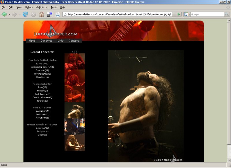
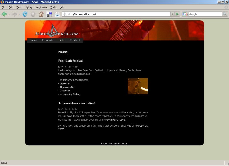
I also noticed that, following some evangelizing on semantics and CSS from me, he had greatly cleaned up the HTML markup. Some pages could still profit from some bettermore pedantic markup though. An example from the news section (cleaned up for readability):
<p> The following bands played:<br>
 - <a href="http://jeroen-dekker.com/concerts/fear-dark-festival-hedon-12-mei-2007/eluveitie-band/">Eluveitie</a><br>
 - <a href="http://jeroen-dekker.com/concerts/fear-dark-festival-hedon-12-mei-2007/thy-majestie-band/">Thy  Majestie</a><br>
 - <a href="http://jeroen-dekker.com/concerts/fear-dark-festival-hedon-12-mei-2007/drottnar-band/">Drottnar</a><br>

 - <a href="http://jeroen-dekker.com/concerts/fear-dark-festival-hedon-12-mei-2007/whispering-gallery-band/">Whispering Gallery</a><br>
</p>
In my opinion, the above is a very awkward way to define what is really an unordered list:
<p>The following bands played:</p>
<ul>
  <li><a href="http://jeroen-dekker.com/concerts/fear-dark-festival-hedon-12-mei-2007/eluveitie-band/">Eluveitie</a></li>
  <li><a href="http://jeroen-dekker.com/concerts/fear-dark-festival-hedon-12-mei-2007/thy-majestie-band/">Thy  Majestie</a></li>
  <li><a href="http://jeroen-dekker.com/concerts/fear-dark-festival-hedon-12-mei-2007/drottnar-band/">Drottnar</a></li>
  <li><a href="http://jeroen-dekker.com/concerts/fear-dark-festival-hedon-12-mei-2007/whispering-gallery-band/">Whispering Gallery</a></li>
</ul>
Finally, a nice touch that I noticed on his site is that he doesn’t have explicit pagination. By this I mean that clicking on the page 2 link simply takes you to the first photo on that page, so that he needs only an URL for each photo and not an URL for each page or even photoset.
Today, while improving the Rails GUI for the Sicirec database, I was struck once again by how annoyingly small <textarea>s can be when having the user type lots of text.
I had already seen the ideal solution when commenting on Laurelin’s waarbenjij.nu weblog. Although their response box is much too narrow, the height of the box auto-adjusts to the amount of text typed. I decided to borrow
their code and amend it slightly for our own use. Differences are:
- My code works with Opera, but is untested in IE because we don’t feel the need to support IE for an internal application.
- In our DB, notes will often be shortened, so my code also shrinks the textarea when the text shrinks. The function remembers the original number of rows set in the source and will never shrink past that number.
userAgentLowerCase = navigator.userAgent.toLowerCase();

function resizeTextarea(t) {
  if ( !t.initialRows ) t.initialRows = t.rows;

  a = t.value.split('\n');
  b=0;
  for (x=0; x < a.length; x++) {
    if (a[x].length >= t.cols) b+= Math.floor(a[x].length / t.cols);
  }

  b += a.length;

  if (userAgentLowerCase.indexOf('opera') != -1) b += 2;

  if (b > t.rows || b < t.rows)
    t.rows = (b < t.initialRows ? t.initialRows : b);
}
The function can easily be added to the onkeyup and onmouseup event handlers of a <textarea> element as in:
<textarea cols="60" rows="4"
          onkeyup="resizeTextarea(this)"
          onmouseup="resizeTextarea(this)"></textarea>
I didn’t add it inline as in the example, though. I used Ben Nolan’s Behaviour Javascript library to tie things together a little more cleanly.
Occasionally, I have to foray into web design. From the look of this blog you can deduce that I’m not really into the design
part of web design. First and foremostly this is because I suck at graphics and colors. But another reason is that I assume that people visit my blog to read some text and not to look at the fancy graphical borders and background of that text.
Recently I’ve gotten into the habit of simply using the default HTML link colors instead of trying to come up with a comprehensible color scheme for each design. This means that my links are blue, my visited links are purple and my active links are red as in the example CSS snippet below.
a:link {
 :;     /* #00f */
}
a:visited {
 :;   /* #800080 */
}
a:active {
 :;      /* #f00 */
}
Recent Comments