Smokes your problems, coughs fresh air.

Tag: CSS (Page 1 of 2)

Web print is still shit, even for CSS2 print features

Having spent ten yours out of the loop, I had somehow expected browser makers to take some time out of their favorite hobby—moving knobs and settings around—to implement CSS printing support. I’m all for saving paper and all, but requiring me to pipe my HTML through LaTeX to produce halfway decent documents doesn’t feel very 2017ish to me. In 2007, it already didn’t even feel very 2007is to me.

I’m trying to make the articles on www.sapiensthabitat.com nicely printable. The good news is that I can finally style my headings so that they do not end up all alone on the bottom of a page. page-break-after: avoid is finally supported, except that it isn’t in Firefox. Well, I’m still happy. Back in 2007, only Opera supported this.

Next stop: I wanted to replace the standard header and footer slapped on the page with something nicer. It turned out that, yes, @page {} is supported now, which makes this rather easy:

@page {
 : 0;
}

Except, then I wanted to add the page number, preferrable in the form n/N to the footer, which turned out to be impossible.

Then, I thought: since my publication pipeline starts with Markdown, I might as well convert that to PDF through LaTeX and then hint to the browser to use the PDF version for printing:

<link rel="alternate" media="print" type="application/pdf" href="print.pdf" />

Never mind. Why did I even for one second think that this would be supported?

Styling visited links for payformystay.com

I wanted to change the text of visited links on payformystay.com, using CSS. In the offer summary, I wanted to change the link text “Check it out!” with “Check it out again!” after the user had indeed checked out the offer.

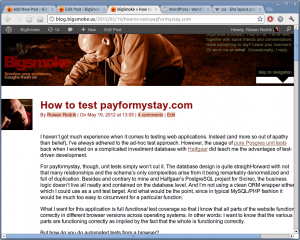
A payformystay.com offer

An example of a payformystay.com offer where I'd want to replace the 'Check it out!' link text.

I thought I could use something as simple as:

<a href="/offer/34234-title">
  <span class="unvisited-label">Check it out!</span>
  <span class="visited-label">Check it out again!</span>
</a>

together with…

a:link span.visited-label,
a:visited span.unvisited-label {
 :;
}
 
a:link span.unvisited-label,
a:visited span.visited-label {
 :;
}

Or, even simpler:

a:visited {
 : 'Check it out again!';
}

However, I bumped into a glass wall while trying to get this to work. Apparently, browser manufacturers have been removing features to increase security. The problem, apparently, is that as a third party you could find out if somebody has been visiting a particular URL by linking to, styling :visited links and then querying the computed styles of the link. To avoid this, getComputedStyle() in the major browsers now lies and most style rules are ignored within rules applied to the :visited pseudo-class.

I’m still considering a work-around with JavaScript (setting a visited class) on the anchors, because I hate to let a good darling die.

WordPress admin bar and absolute CSS positioning

WordPress 3.2 introduced an admin bar, which is fixed at the top of the window when you’re logged in. An annoying side-effect that has been bugging me for some time is that, although this pushed down most of my content, HTML elements that used absolute positioning stayed in there old place. This didn’t look particularly good, but I left it hanging for a long time because it only affected logged in users (that is: either me or Halfgaar).

The fix is actually rather simple. I added the following rule:

body {:; }

It may seem non-obvious, but absolutely positioned elements are actually positioned relative to their relatively positioned ancestors. Well, just read the proper explanation at CSS-Tricks. I can’t explain this shit.

WordPress admin bar with correct positioning

How it was supposed to look

WordPress admin bar induced CSS positioning screw-up

How it really looked

Safari: don’t give gzipped content a .gz extension

Yesterday, while helping Caloe with the website for her company De Buitenkok, I came across the mother of all stupid bugs in Safari. Me having recently announced payformystay.com, I loaded it up in Apple’s hipster browser only to notice that the CSS wasn’t loaded. Oops!

Reloading didn’t help, but … going over to the development version, everything loaded just fine. Conclusion? My recent optimizations—concatenating + gzipping all javascript and css—somehow fucked up payformystay for Safari users. The 14 Safari visitors (16.28% of our small group of alpha users) I received since the sixth must have gotten a pretty bleak image of the technical abilities of payformystay.com’s Chief Technician (me). 😥

The old cat | gzip

So, what happened?

To reduce the number of HTTP requests per page for all the JavaScript/CSS stuff (especially when none of it is in the browser cache yet), I made a few changes to my build file to scrape the <head> of my layout template (layout.php), which I made to look something like this:

<?php if (DEV_MODE): ?>
  <link rel="stylesheet" type="text/css" href="/layout/jquery.ui.selectmenu.css" />                                   <!--MERGE ME-->
  <link rel="stylesheet" type="text/css" href="/layout/fancybox/jquery.fancybox-1.3.4.css" />                         <!--MERGE ME-->
  <link rel="stylesheet" type="text/css" href="/layout/style.css" />                                                  <!--MERGE ME-->
 
  <script src="/layout/jquery-1.4.4.min.js" type="text/javascript"></script>                                          <!--MERGE ME-->
  <script src="/layout/jquery.base64.js" type="text/javascript"></script>                                             <!--MERGE ME-->
  <script src="/layout/jquery-ui-1.8.10.custom.min.js" type="text/javascript"></script>                               <!--MERGE ME-->
  <script src="/layout/jquery.ui.selectmenu.js" type="text/javascript"></script>                                      <!--MERGE ME-->
  <script src="/layout/jquery.cookie.js" type="text/javascript"></script>                                             <!--MERGE ME-->
  <script src="/layout/fancybox/jquery.fancybox-1.3.4.js" type="text/javascript"></script>                            <!--MERGE ME-->
  <script src="/layout/jquery.ba-hashchange.min.js" type="text/javascript"></script>                                  <!--MERGE ME-->
  <script src="/layout/jquery.writeCapture-1.0.5-min.js" type="text/javascript"></script>                             <!--MERGE ME-->
<?php else: # if (!DEV_MODE) ?>
  <link href="/layout/motherofall.css.gz?2" rel="stylesheet" type="text/css" />
  <script src="/layout/3rdparty.js.gz?2" type="text/javascript"></script>
<?php endif ?>

It’s very simple: All the files with a “<!--MERGE ME-->” comment on the same line got concatenated and gzipped into motherofall.css.gz and 3rdparty.js.gz respectively, like so:

MERGE_JS_FILES := $(shell grep '<script.*<!--MERGE ME-->' layout/layout.php|sed -e 's/^.*<script src="\/\([^"]*\)".*/\1/')
MERGE_CSS_FILES := $(shell grep '<link.*<!--MERGE ME-->' layout/layout.php|sed -e 's/^.*<link .*href="\/\([^"]*\)".*/\1/')
 
all: layout/3rdparty.js.gz layout/motherofall.css.gz
 
layout/3rdparty.js.gz: layout/layout.php $(MERGE_JS_FILES)
        cat $(MERGE_JS_FILES) | gzip > $@
 
layout/motherofall.css.gz: layout/layout.php $(MERGE_CSS_FILES)
        cat $(MERGE_CSS_FILES) | gzip > $@

Of course, I simplified away the rest of my Makefile. You may notice that I could have used yui-compressor or something alike to minify the concatenated files before gzipping them, but yui-compressor chokes on some of the third-party stuff. I am using it for optimizing my own css/js (again, only in production).

Safari ignores the Content-Type for anything ending in .gz

As far as the HTTP spec is concerned, “file” extensions mean absolutely nothing. They’re trivial drivel. Whether an URL ends in .gz, .css, .gif or .png, what it all comes down to is what the Content-Type header tells the browser about the response being sent.

You may have noticed me being lazy in the layout template above when I referenced the merged files:

<link href="/layout/motherofall.css.gz?2" rel="stylesheet" type="text/css" />
  <script src="/layout/3rdparty.js.gz?2" type="text/javascript"></script>

I chose to directly reference the gzipped version of the css/js, even though I had a .htaccess files in place (within /layout/) which was perfectly capable of using the right Content-Encoding for each Accept-Encoding.

$ cat /layout/.htaccess

AddEncoding gzip .gz
 
RewriteEngine On
 
RewriteCond %{HTTP:Accept-Encoding} gzip
RewriteCond %{REQUEST_FILENAME}.gz -f
RewriteRule ^(.*)$ $1.gz [QSA,L]
 
<Files *.css.gz>
ForceType text/css
</Files>
 
<Files *.js.gz>
ForceType application/javascript
</Files>

You may notice that the .htaccess file contains some configuration to make sure that the .gz files are not served as something like application/gzip-compressed.

Anyway, I went to see if there were any browsers left that do not yet Accept-Encoding: gzip and could find none. When, yesterday, I was faced with an unstyled version of my homepage, my first reaction was (after the one where I was like hitting reload 20 times, embarrassedly mumbling something about “those damn browser-caches!”): “O then, apparently, Safari must be some exception to the rule that browsers have all been supporting gzip encoding for like forever!”

No, it isn’t so. Apparently Safari ignores the Content-Type header for any resource with an URL ending in .gz. Yes, that’s right. Safari understands Content-Encoding: gzip just fine. No problem. Just don’t call it .gz.

The new cat ; gzip

So, let’s remove the .gz suffix from these files and be done with it. The .htaccess was already capable of instructing all necessary negotiations to be able to properly serve the gzipped version only when it’s accepted (which is always, but I digress).

A few adjustments to my Makefile:

MERGE_JS_FILES := $(shell grep '<script.*<!--MERGE ME-->' layout/layout.php|sed -e 's/^.*<script src="\/\([^"]*\)".*/\1/')
MERGE_CSS_FILES := $(shell grep '<link.*<!--MERGE ME-->' layout/layout.php|sed -e 's/^.*<link .*href="\/\([^"]*\)".*/\1/')
 
all: layout/3rdparty.js.gz layout/motherofall.css.gz layout/pfms.min.js.gz
 
layout/3rdparty.js: layout/layout.php $(MERGE_JS_FILES)
	cat $(MERGE_JS_FILES) > $@
 
layout/motherofall.css: layout/layout.php $(MERGE_CSS_FILES)
	cat $(MERGE_CSS_FILES) > $@
 
%.gz: %
	gzip -c $^ > $@

And here’s the simple change to my layout.php template:

<link href="/layout/motherofall.css?2" rel="stylesheet" type="text/css" />
  <script src="/layout/3rdparty.js?2" type="text/javascript"></script>

That’s it. I welcome back all 14 Safari users looking for paid work abroad! Be it that you’re looking for international work in Africa, in America, in Asia or in Europe, please come visit and have a look at what we have on offer. 😉

Ytec, WordPress and Aihato.nl

On Oktober, the 25th, in what will be known to future generations as a historical move, Wiebe changed the A record of www.aihato.nl to point to the new production site running at Ytec. The new site, a collaboration by Ytec and me, based on WordPress, has been in development since May. At least, that’s when I started taking notes. There had been some discussion, wire-framing and design done before that time.

The graphical design for the new Aihato website was created in Photoshop by a Ytec employee, building on a wire-frame created by Ying Hao (good friend and owner of Ytec). Another Ytec employee freed me of the burden of slicing the design into HTML/CSS, so that I could concentrate on the WordPress programming work involved. I liked not having to worry too much about design for once.

Comfortably Installed at Ytec

Comfortably Installed at Ytec

Initial development setup

Because I had decided to put WordPress in its own subdirectory to keep my custom stuff separate from the factory default stuff, I needed my own vhost at Ytec, something I had gotten used to with all my previous web development projects. Initially, I tried to make things work in my own ~subdirectory on a shared vhost, but this wreaked havoc with the rewrite voodoo that I needed to make WordPress live comfortably in its own subdir. Maybe, it would have been better to use vendor branches; but decisions, decisions…

A Makefile for deployment, sychronisation and backups

On many of my recent projects, I’ve used Rake instead of GNU Make. This time, I took it oldschool to pimp up my Make skills a bit. This proved pretty necessary, because I’ve spent ages on a bug in a previous version of the Makefile were I defined a variable after a make target without realizing that I had to put this in a separate rule from the instructions to make that target.

Why I even need a Makefile? Because when you’ve had your fair share of deployment, synchronisation and backup problems, you like to define rules to avoid these problems. Makefiles are ideal for that purpose, because they consist of rules.

I’m publishing the Makefile here because it’s one of the prettier Makefiles I’ve made and I like to brag and remember myself of some of the new things that I learned during its creation.

RSYNC_OPTIONS := --verbose --progress --recursive --delete --links --times --filter='merge ./rsync-upload-filters'
WORKING_COPY_ROOT := ${HOME}/www.aihato.nl/
LIVE_PRODUCTION_ROOT := ytec.nl:/too/much/info/aihato.nl/
LIVE_DEVELOPMENT_ROOT := ytec.nl:/too/much/info/aihato-dev/
MYSQL_LOGIN := --user=aihato --password=InYourDreamsIdForgetToChangeThis
 
 
deploy-production:
    # First, I sync everything except the symlink to the current WP version
    rsync $(RSYNC_OPTIONS) --filter="exclude /wp"  $(WORKING_COPY_ROOT) $(LIVE_PRODUCTION_ROOT)
    # Now, if the symlink's target has changed, we've atomically upgraded all WP files
    rsync $(RSYNC_OPTIONS) $(WORKING_COPY_ROOT) $(LIVE_PRODUCTION_ROOT)
 
backup-production: 
    rsync ${RSYNC_OPTIONS} $(LIVE_PRODUCTION_ROOT)uploads/ $(HOME)/aihato-uploads/
    ssh ytec.nl "mysqldump $(MYSQL_LOGIN) aihato" > aihato.sql
 
update-development: 
    rsync $(RSYNC_OPTIONS) $(WORKING_COPY_ROOT) $(LIVE_DEVELOPMENT_ROOT)
    rsync $(RSYNC_OPTIONS) $(LIVE_PRODUCTION_ROOT)uploads/ $(LIVE_DEVELOPMENT_ROOT)uploads/
    ssh ytec.nl "mysqldump $(MYSQL_LOGIN) aihato | mysql $(MYSQL_LOGIN) dev_aihato"
 
backup-development: mysql-dump-development
    rsync ${RSYNC_OPTIONS} $(LIVE_DEVELOPMENT_ROOT)uploads/ $(HOME)/aihato-uploads/
 
mysql-dump-development:
    ssh ytec.nl "mysqldump $(MYSQL_LOGIN) dev_aihato" > dev_aihato.sql
 
.PHONY: update-development backup-production deploy-production mysql-dump-development
www.aihato.nl – Front page – top portion

Top portion of the front page

www.aihato.nl – Settings – Reading

www.aihato.nl – Settings – Reading

Front page

The front page, after the header with the navigation and logo, starts with of a little snippet of text to welcome visitors. The rest of the page is filled with some selected stuff from the rest of the website: the latest news excerpts (plus a link to the full archive and the news feed and the Aihato hyve), clickable sponsor logos, some upcoming agenda items, a promotional movie clip, the latest video from the video gallery, a carousel with the latest photos, another carousel with all the fighter profiles and the latest fight results.

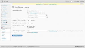
In WordPress, when you want the home page to be a static page, you have to change a setting in the Settings / Reading subpanel. You will then have to choose another page to be the “posts” page. The other page will than use the template hierarchy the same way the home page would without this setting. The only custom page template you can use for it is home.php, which might cause confusion with the actual home page.

Template entanglement

The start page is one of a number of pages for www.aihato.nl that needed a custom template. To associate a custom template with the start page, I had two choices: I could either name the template file page-3.php, according to the Template Hierarchy, or I could create a Page Template. The difference between the two options is that with the latter option, the association with the custom template happens from the Edit Page screen, whereas the first option relies on the naming of a template file in my theme. I chose the first option, which is a bit ugly, because after setting a page as start page, editing the page slug is no longer possible. (Normally you can name the template file page-<slug>.php, which is clearer and doesn’t depend on database state.) Both solutions are ugly in a sense because there’s just too much stuff in the database to my taste, but that’s another story which I’ll probably tell in reference to Drupal one day, since Drupal is way uglier than WordPress in this sense.

I’ve ended up with a bit of a random mix of page-targeted templates and templates targeted from pages. The highlight is a template which does both: page-sportschool.php targets the page with the “sportschool” slug, but also has the following comment so that I can select it from the Page Edit screen for the subpages of “sportschool”:

<?php
/*
Template Name: Sportschool 
 */
?>
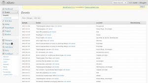
Aihato Events mangement interface

Aihato Events mangement interface

Events

It was decided that the new website, like the old website, would have an agenda. The old website’s agenda was never up-to-date, so the new agenda should be easier to edit. To that end, I created an aihato-events plugin.

The plugin is quite simple. It adds two tables to the database – one to record (and announce) events and another to store fight results for these events (wins, losses, etc.). The second table links to a fighter profile by post ID (but more about that later).
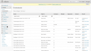
Aihato Event Contestants
Aihato Event Contestants

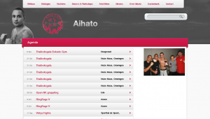
Agenda page

Agenda page

The event management interface is pretty decent. It includes a few darlings, which I wouldn’t like to kill, except that I will probably overhaul the whole Aihato Events UI at some unspecified time in the future. The darlings are small touches such as the “Add new” buttons above and below the table which add a new row through AJAX at the top or the bottom of the table depending on which button is clicked. I’m also always a sucker for the in-place AJAX editing of the rows. The reason why I’ll probably still overhaul the UI at some future time is that I don’t like the same simple tabular interface for the Contestants panel. I had predicted that fight events would generally first be placed in the agenda before the event takes place, untill after the event, the results would be added. So far, nothing has been placed in the agenda before it takes place. Only after, to be able to link it to the results to be added. And even if this wasn’t true, the two screens should still become one I think.

The homepage contains the first few upcoming events. Sadly, there aren’t any yet. 😕 Below that short (and empty) list, there’s a big button which links to the complete agenda. This page has a design that somewhat deviates from the rest. Of course, it also has some custom template programming (in a template called page-agenda.php).
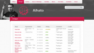
Page with fight results

Page with fight results

Event results

The homepage also contains all the fight results for the latest event in a nice little table at the bottom right. Consistent with all the other areas on the homepage, this one is also followed by a link to the results for all recorded events in the form of a nice big button. The page with the complete results is powered by page-uitslagen.php.

This is one of the templates which I should really clean up by moving some code into nice and clean helper functions that live in the theme’s functions.php instead of all over the place.

I18n

My interest in internationalization for this website extends only as far as that I want the visitor to be talked to in Dutch as much as possible. For the rest, I don’t really care. How much I don’t care can be summed up by the total absence of __()-encapsulated strings in my theme. What’s worse: my custom plugins also lack these l10n hooks, although, because I always feel like a sinner when working directly in what is considered a translation target by me and the rest of the English-oriented development world, the event management stuff that I added to the management interface is in English (although, again, without l10n hooks, so what’s the point?).

Aihato – Profile – Tobias

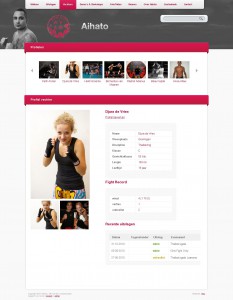
Fighter profile for Tobias

Aihato – Edit fighter profile

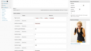
Editing a fighter profile now

Aihato – Profile – Djura

Fighter profile for Djura

Fighter profiles

Fighter profiles play a dominant role in the new design. Implementation took some time, and I’m still not entirely satisfied. During development, custom post types were introduced in WordPress. I had already implemented the fighter profiles using a page template and a whole heap of custom fields. Adding new profiles this way, however, is far from user-friendly. The user has to:

  • Set the page parent to “Vechters” (Dutch for “Fighters”);
  • set the page template to “Vechter”;
  • add new custom fields for Discipline, Fight record, Weight, Class, Age, Length and City while making sure that the values are entered correctly since these don’t have a type;
  • and set a featured image for display in the fighter carousel on the front page and above the profiles.

This is a lot of work, none of which is very obvious, so I hoped that custom post types would save the day. Theoretically they could have, but there were a few issues, some of which I only encountered when I was already quite far into the development of an aihato-profiles plugin which implemented the aihato_fighter custom post type.

I started out by fooling with some plugins to do some of the heavy lifting (such as Custom Post Type UI). I wasn’t particularly charmed by these for reasons which I’ve sadly forgotten because I haven’t commented on it at the time. One reason I can think of is that I never like defining stuff in the database which I feel belongs in a file.

There seemed to be a bug in the custom post type admin interface created by WordPress in that, even though I had enabled thumbnail support for my post type, the UI for this was lacking. Another bug related to images was that clicking the Insert image button replaced the current page with the upload dialog instead of loading it in a modal dialog through AJAX. These two bugs were show-stoppers. I won’t comment any further on the whole custom post type development process until I actually continue this process.

Anyway, it all works now and I don’t mind doing some work on new fighter profiles myself. Editing existing ones is easy enough, and at the visitor end, it all looks sexy enough. 😎

Guest-book

Implementing the guest book was pretty easy. What was less easy was importing all the entries from the old guest-book. Although, even that was incredibly easy compared with extracting (exporting is too expensive a verb) the entries from the old guest-book. The old guest-book was basically impossible to spider, because the pagination depended on POST. If it were only the page number in the POST request, it wouldn’t have been too bad (and quite hackable for my purpose), but there was all sorts of session-related crap and other ugly stuff that smelled like a bunch of Microsoft Monkeys had gone all out in a HTTP obfuscation contest.

My initial import strategy consisted of a simple PHP script (with a function adapted from some plugin) to be ran from the command-line, that accepted the author and date as arguments and the post body over STDIN.

<?php
 
require_once('wp-config.php');
 
function guestbook_new_comment ( $commentdata ) {
  $commentdata['comment_post_ID'] = 19 # This is the Aihato guestbook page
  $commentdata['user_ID']         = 0 # These people don't have accounts
 
  $commentdata['comment_author_IP'] = '127.0.0.1' $_SERVER['REMOTE_ADDR'];
  $commentdata['comment_agent']     = 'Hacked together import scripts (by BigSmoke)';
 
  // We want to use the original comment date, not the time now.
  //$commentdata['comment_date']     = current_time('mysql');
  //$commentdata['comment_date_gmt'] = current_time('mysql', 1);
 
  // Automatically approve these comments.
  $commentdata['comment_approved'] = 1;
 
  // Actually add to the database
  $comment_ID = wp_insert_comment($commentdata);
 
  do_action('comment_post', $comment_ID, $commentdata['comment_approved']);
 
  return $comment_ID;
}
 
$commentdata['comment_author'] = $ARGV[1];
$commentdata['comment_date'] = $commentdata['comment_date_gmt'] = $ARGV[2];
$commentdata['comment_content'] = trim(readfile(STDIN));
 
$new_comment_id = guestbook_new_comment($commentdata);
echo "Inserted new comment $new_comment_id to post 19.\n";
 
?>

The script would be called from a Ruby script that parsed the ugly-ass HTML-like tag soup also known as the old guest-book. I have to admit that the script is as ugly as the shit it’s supposed to make sense of. Fuck it! One-of scripts don’t need to look good; it’s already been deleted from svn 75 revisions ago.

However, I never could call the PHP script from the Ruby script because I couldn’t get the necessary gems to install on the development server where the import needed to happen, so I ran the script locally and modified it to use WordPress’ XML-RPC interface. To make this work, I only had to install a WordPress plugin to allow anonymous comments through XML-RPC. (See my previous notes on this subject, if you’re interested.)

[By the way, I just copied this script to the clipboard using “svn cat https://svn.ytec.nl/svn/aihato/trunk/import-guestbook.rb@37|xsel --clipboard”; see my post on xsel if you want to learn more.]
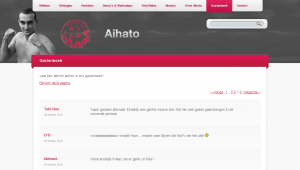
Aihato - Guestbook

The finished guestbook, complete with all the old and new enties

#!/usr/bin/ruby
 
require 'scrapi'
require 'open3'
require 'xmlrpc/client'
 
 
guestbook_entry = Scraper.define do
  process "td > div.GB_Head > div.GB_Date", :date => :text
  process "td > div.GB_Head > div.GB_Name", :name => :text
  process "td > div.GB_Body > div.GB_BodyText", :body => :element
 
  result :date, :name, :body
end
 
guestbook = Scraper.define do
  array :entries
 
  process "table.GB_MainGrid tr", :entries => guestbook_entry
 
  result :entries
end
 
# I need to do this because the document has at least 3 <html> tags,
# so it's impossible to parse, even for Tidy
fake_document = "<html><body>"
reading_guestbook_table = false
STDIN.readlines.each do |line|
  if line =~ /<table class="GB_MainGrid"/
    reading_guestbook_table = true
  end
  
  if reading_guestbook_table
    fake_document += line
    reading_guestbook_table = false if line =~ %r{</table>}
  end
end
fake_document += "</body></html>"
 
entries = guestbook.scrape(fake_document)
 
entries.delete_at(0)
 
entries.each do |entry|
  next unless entry['body']
 
  date_parts_in_proper_order = entry['date'].split(/-/).reverse
  date_string_with_proper_zeroes = "%d%02d%02dT00:00:00" % date_parts_in_proper_order
  entry['date'] = XMLRPC::Convert.dateTime( date_string_with_proper_zeroes )
 
  server = XMLRPC::Client.new("aihato.dev.ytec.nl", "/wp/xmlrpc.php")
 
  entry['body'] = entry['body'].to_s
  entry['body'].gsub!(%r{<div class='GB_BodyText'>(.*)</div>}m, '\1')
  entry['body'].gsub!(%r{</p>\s*<p>}, "\n\n")
  entry['body'].gsub!(%r{</?p>}, "")
  entry['body'].chomp!
 
  new_comment_id = server.call('wp.newComment', 1, '', '', 19, {'comment_parent' => 0, 'content' => entry['body'].to_s, 'author' => entry['name'], 'author_url' => '', 'author_email' => 'dummy@example.com'} )
 
  puts new_comment_id.inspect
  
  # Change date and approval status
  server.call('wp.editComment', 1, 'myuser', 'nottherealpassword', new_comment_id, {'status' => 'approve', 'date_created_gmt' => entry['date'], 'author' => entry['name'], 'author_email' => 'dummy@example.com'})
 
  #Open3.popen3("php -q import-guestbook.php '#{entry['name']}' #{entry['date']}") do |stdin, stdout, stderr|
  #  stdin << entry['body']
  #end
end

Because I was too stupid to write a spider function to download the old guest-book, I ended up simply clicking through all the pages and feeding the page source to my import script one page at the time.

The new guest book is the only page on the website with comments enabled. For the rest it’s like any other page with its own custom template (page-gastenboek.php).
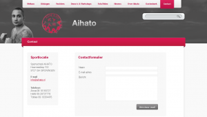
Aihato – Contact

The contact form

Contact form

In my notes made during the development process, I have made a few comments (1, 2, 3, 4) about the troubles I had when looking for a simple plugin to create a simple contact form. I would have saved quite some time if I had skipped the search and wrote my own code to handle it. In the end I did use a plug-in. Well, I forked it, but that’s just another way of using it, isn’t it?
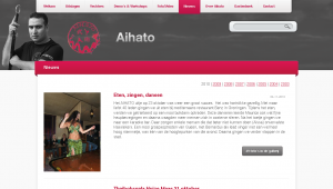
Aihato - News - 2010

The news archive

News

The actual news section (where I could use WordPress’ core strength – its blogging engine) is maybe the foremost reason why I let myself be suckered into another web project despite my many vows to never program for money again. (Well, this being a club project, means that I could somewhat sidestep my many promises to myself, because there was hardly money involved in the process. (I train for free for a year.))

The old website’s news page was just a very long list of all the news since 2003. This was pretty suck-ass. What was much worse, though, was that there was no RSS feed. This new website being WordPress based means that I have a whole slew of feeds to chose from. It gave me quite a kick when the first news item posted by someone else hit my feed reader. Now, there are no longer any sites left that I have to manually check for updates. Yay!

An interesting choice I made for the news archive is that I skipped pagination altogether and instead presented a list of years all the way back to 2003 where you’d normally expect to see pagination. Personally, I don’t mind long pages. In fact, I often find clicking “Next” and “Previous” infinitely much more annoying.

Commenting on the news isn’t allowed by request of the Aihato boys. They gave some pretty good reasons not to do this mostly related to the intentional abuse by club members and members of competing clubs that they’ve seen on the website of a friendly club.

The news section is just one of the many places where I’ve made thankful use of WordPress’ new Post Thumbnails feature. I like it when stuff that’s only available through clumsy hacks and plugins makes it into core. By the way: when working with post thumbnails, the regenerate-thumbnails plugin proved to be an enormous aid.

Aihato – Photo albums

Overview of all photo albums

Aihato – Photo album – Ede

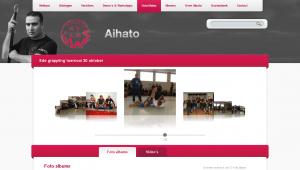
Photo album of a grappling competition

Media gallery

Even on the old website, the foto gallery played an important role. Thinking of the best way how to do this in WordPress was quite a headache.

To start with, the design requirements were pretty steep. Ying had included a coverflow-like effect in his wire-frame for viewing individual albums. Luckily, the list of photo albums wasn’t too difficult (a simple grid-view) and made easier still by the HTML/CSS guy. I also skipped a few requirements such as highest rated photos and videos. (I skipped the rating feature altogether.) Still, I spent a lot of time looking through available plug-ins and into different ways to solve the most challenging requirement: there had to be a separate section for the photo albums and the videos, where intuitively I’d simply include it all in the news as is customary with a blog. In the end, I did exactly this but with a twist.

The process of publishing a new photo album has become extremely straight-forward: the user has to upload the images using the Add image link, insert the gallery in the post (if they want a clear link from the news item view to the gallery) and check the “Fotogalerij” (Dutch for “photo gallery”) category (if they want the album to appear in the list of albums).

Since I’ve chosen not to make photo albums a separate entity in the back-end, I had to work a little magic to make them appear as such to the visitor. But I didn’t want to make the separation go too far; I don’t like websites (such as the old Aihato website) where the photo gallery seems bolted on as an afterthought and the user has to upload an album and then create a link to the album in the news.

The gallery view

You know how WordPress makes a comments feed available for every post? It accomplishes this using something it calls a rewrite endpoint (“feed” for feeds). For example:

http://www.example.com/blog/2010/11/08/post-with-interesting-comments/feed/atom/
http://www.example.com/blog/2010/11/08/post-with-interesting-comments/feed/rss/ 

You can add such a rewrite endpoint yourself using the add_rewrite_endpoint() function. The code below shows how I created an alternative view for my posts and pages called “gallery”. It also shows what I need to do to make an extra query variable available with the name of the endpoint. The part after the slash after the endpoint in the URL become the new query variable’s value.

add_rewrite_endpoint('gallery', EP_PERMALINK | EP_PAGES);
$wp_rewrite->flush_rules();
 
add_filter('query_vars', 'aihato_queryvars');
add_action('template_redirect', 'aihato_special_gallery_template');
 
function aihato_special_gallery_template() {
  global $wp_query;
 
  if ( is_category('fotogalerij') or is_category('filmgalerij') ) {
    include(TEMPLATEPATH . '/galleries.php');
    exit;
  }
 
  if ( isset($wp_query->query_vars['gallery']) ) {
    include(TEMPLATEPATH . '/gallery.php');
    exit;
  }
}
 
function aihato_queryvars($qvars) {
  $qvars[] = 'gallery';
  return $qvars;
}

The code above creates an alternative “view” of posts that I can use to view all the images attached to that post. When the user inserts the gallery into a post, the following code makes it so that instead of the images, the visitor will see a link to the gallery view of that post.

add_filter('post_gallery', 'aihato_gallery_filter', 2);
 
/**
 * Modifies the behaviour of the [gallery] shortcode.
 */
function aihato_gallery_filter($null, $attr = array()) {
// Snipped: code to generate a nice link
}

ContentFlow / FancyBox integration

To make the gallery view look cool, I implemented the CoverFlow effect using the ContentFlow jQuery plugin. It’s pretty cool. It supports reflection, scrolling with a scroll wheel and it just feels right™. I hooked it up to FancyBox, a very slick Lightbox clone for jQuery. The result was, I must say, immensely pleasing. 🙂 Both effects support scrolling and the FancyBox effects make it look like the images in the ContentFlow are really blown up and shrunk. (I’ve made it so that the FancyBox appears when you click the active image in the ContentFlow.)

This is some of the spaghetti code that made the two effects play nicely together:

// Returns the offset of the item to start showing
function albumFlowStartItem() {
  var hashNumber = window.location.hash;
 
  if ( hashNumber && hashNumber.match(/^#\d+$/) ) {
    hashNumber = hashNumber.replace(/^#(\d+)$/, '$1');
    return jQuery('#album_flow a#attachment-'+hashNumber).prevAll().size();
  }
 
  return 'center';
}
 
// My own custom state variable
jQuery.fancybox.remainActiveUntilClosed = false;
 
jQuery(document).ready(function() {
  jQuery('#album_flow a').fancybox({
    transitionIn: 'elastic',
    transitionOut: 'elastic',
    speedIn: 600,
    speedOut: 200,
    overlayShow: false,
    cyclic: true,
    onStart: function(selectedArray, selectedIndex, selectedOpts) {
      element = selectedArray[selectedIndex];
 
      return jQuery.fancybox.remainActiveUntilClosed || element.hasClassName('active');
    },
    onComplete: function() {
      jQuery.fancybox.remainActiveUntilClosed = true;
    },
    onClosed: function() {
      jQuery.fancybox.remainActiveUntilClosed = false;
    }
  });
 
  var albumFlow = new ContentFlow('album_flow', {
    reflectionHeight: 0.3,
    flowSpeedFactor: 0.7,
    startItem: albumFlowStartItem(),
    onclickActiveItem: function(item) {
      var itemOffset = jQuery(item.element).prevAll().size();
      jQuery.fancybox.pos(itemOffset);
    },
  });
});

Categories for photo/video galleries

To make a post appear in the photo gallery, you just have to check that category. Making posts appear in the video gallery works the same. These listings are displayed using the galleries.php template thanks to a little bit of code in aihato_special_gallery_template(). I redirected these archive views to that template because otherwise I’d have had to make a symlink to use the same file for the video category and the photo category. (I’d have needed two files: category-fotogalerij.php and category-filmgalerij.php.)

I like how I simply used a custom view of both a post and of two different category archives to achieve all my media gallery requirements. There’s no wild database customizations or heavy plug-ins involved. It’s low-fat and carb-free.
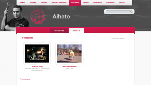
Aihato - Film gallery

The film gallery

YouTube is king

Because I was too lazy to find a good playback solution and I’m a bit reluctant to self-host video files anyway, I decided to put together something that relies solely on embedding videos hosted elsewhere. To be completely honest, although WordPress is quite flexible in this sense, “elsewhere” means just YouTube here.

The idea is simple: WordPress already allows you to just paste a YouTube URL into the post editor and all the embedding code is created for you. Building on this, to show the latest video on the homepage, I just perform a search for posts which contain a YouTube URL. Then I parse the content a bit, and include the YouTube ID in my own low-res embed code. (The latest video area on the homepage is smaller than the default embed created by WordPress.)

When generating the film gallery overview, my theme goes through all the YouTube URLs in all posts categorized as “Filmgalerij”. For each of these URLs, it uses the YouTube API to retrieve the movie title and the URL of an adequately sized thumbnail. That means that, for thumbnails to appear in the gallery, the associated posts don’t need a featured image, just one or more YouTube URLs. This approach also makes it so that you can embed as much YouTube URLs in each post as you like, since the gallery will cope beautifully.

When a visitor clicks a movie thumbnail, a YouTube embed pops up using FancyBox. Did I mention how cool FancyBox is? Pretty damn cool:

jQuery('a.youtube').click(function(){
  jQuery.fancybox({
    'padding': 0,
    'autoScale': false,
    'transitionIn': 'none',
    'transitionOut': 'none',
    'title': this.title,
    'width': 680,
    'height': 495,
    'href': this.href.replace(new RegExp("watch\\?v=", "i"), 'v/'),
    'type': 'swf',
    'swf': {
      'wmode': 'transparent',
      'allowfullscreen': 'true'
    }
  });
 
  return false;
});

Menus and navigation

// This is the ultimate in ugly hacks. Enjoy! :-)
function aihato_main_menu_filter($items) {
  global $wp_query;
 
  // menu-item-639 = Nieuws
  // menu-item-643 = Foto/Video (connected to the fotogalerij category)
 
  // This conditional makes it the current-menu-item also when we're in the filmgalerij category,
  // and when we're looking at the gallery view of a post (through the gallery rewrite endpoint).
  if ( is_category('filmgalerij') or isset($wp_query->query_vars['gallery']) ) {
    $items = preg_replace('!(menu-item-643)!', '\\1 current-menu-item', $items);
  }
  // This conditional ensures that the Nieuws menu item is active when we don't want to be in the gallery.
  // At the same time, it makes sure that the the Foto/Video menu item is inactive.
  elseif ( !isset($wp_query->query_vars['gallery']) and (is_archive() or is_single()) ) {
    $items = preg_replace('!(menu-item-639)!', '\\1 current-menu-parent', $items);
    $items = preg_replace('!current-menu-parent current-post-parent (menu-item-643)!', '\\1', $items);
  }
 
  return $items;  
}

As soon as WordPress 3.0 was released somewhere during the development of this website, I started to use its new Custom Menu Management feature.

Before the change:

<?php wp_list_pages(array( 'depth' => 1, 'title_li' => '', 'sort_column' => 'menu_order, post_title' )) ?>

After the change:

<?php wp_nav_menu(array( 'menu' => 'main', 'depth' => 1 )) ?>

As you can see, the change wasn’t difficult, but, more importantly, it gave me some useful powers that I could use for good. For the main menu, I could include a category, which I used to add the Fotogalerij category. I could also change the label of that item to be different from the category name so that it also seems to apply to the Filmgalerij category. That, together with the ugly hack above, gave me my illusionary Photo/Video category.
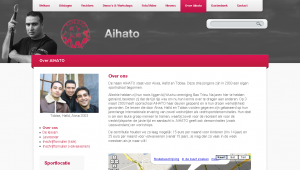
Aihato – Sportschool

Putting custom menus to good use in this section

Another place where I could put the custom menus to good use was the Sportschool section. There I had to design a submenu, because designers always forget a few vital pieces in their design, such as how submenus should look. However, the submenu shouldn’t just include links to pages, but also links to two different subscription forms (uploads). The new menu system allows me to do this quite easily.

So, again, I could replace something that didn’t do exactly what I wanted:

<?php wp_list_pages(array( 'title_li' => get_the_title(11), 'child_of' => 11, 'include' => array(11) )); ?>

With something simpler that did:

<?php wp_nav_menu(array( 'menu' => 'school' )) ?>

It is a curious aspect of this website that every section has its own means of navigating within that section.

  1. The fighter profiles section uses a carousel at the top to select fighters. In the future, some form controls to filter the carousel will also be added.
  2. The Photo/Video gallery is divided into two subsections (one for photos and one for videos). These subsections are subsequently navigated using a grid view of the individual photo albums or videos. When viewing a photo album, navigation is further refined using the ContentFlow UI.
  3. The news section is subdivided in yearly archives which are presented as a sort of pagination interface.
  4. The Sportschool (“Over Aihato”) section sports a simple “submenu” in the left column. This is in fact a separate menu defined in the theme and managed using the new menu editor.
  5. Finally, the guestbook uses WordPress’ default comment pagination.

Conclusion

This turned out to be a pretty long post taking a ridiculous amount of time to write. But, hey, this way I have at least documented the project. I don’t think that such detailed documentation would have happened otherwise. In my experience, “in-house” documentation sucks donkey ass. It’s never complete. It’s never up-to-date and – worst of all – it doesn’t invite comments. It’s just not part of big WWW.

I’m glad that the new website is on-line. I love how it turned out (even though I still hate web development). The enthusiastic reception of this project even compensates for some of my previous web development traumas. 😉 I find myself quite enjoying the after-work because of the laid-back attitude of the guys. What’s worse: I’m actually looking forward to implementing some of the planned improvements. That’s strange. Maybe it’s the complete lack of hysterics about the shape of a particular icon (“I want the trash can back!”) or the phrasing of a particular sentence (“How could this have happened?! You should have quadruple-checked this first! Aaarggh! Now our company will die because we look unprofessional!”). Some people are just more fun to work forwith than other people I guess.

eCSStender

Through this article on A List Apart, I came across a new project called eCSStender, which aims to make it easier to implement and test new CSS features across different browsers using JavaScript. As a side effect it can also be used to avoid having to fork your CSS code if you want to use cutting edge CSS features that are not yet available in all browsers.

I wonder how this compares to IE7.js… Well, I know IE7.js has already saved me from at least some parts of the IE compatibility nightmare on two of my more recent web projects, so, for now, I’ll stay with what I know.

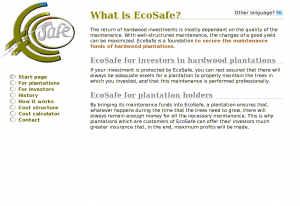
www.stichting-ecosafe.org

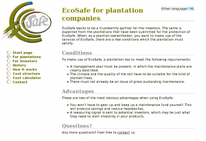
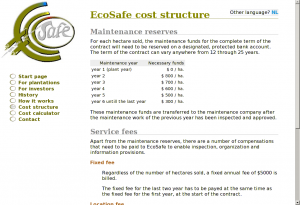
Stichting EcoSafe is a Dutch foundation for the safe-keeping of the funds that are necessary for the maintenance of hardwood plantations. In July of 2006, together with Johan Ockels, I created a website for the Foundation. Johan was responsible for the organization of the whole process. This went very smooth and the website ended up being an emblem of simplicity and clarity. That’s why I wanted to blog a bit about it now, even though there are a few things that I’d probably end up doing different if I were to start from scratch. [There’s actually a disturbing number of things for which this is true, I’m coming to notice.]

File structure

Like with most websites, I started with creating an SVN repo so that I wouldn’t have to be afraid of ever losing anything.

The file structure was pretty standard:

  • a css dir for stylesheets;
  • img for images;
  • inc for shared PHP and mod_include stuff and for AJAX partials;
  • jot for to-do’s and other notes;
  • and js for JavaScript files and libraries.

Possible file structure improvements

If I were to redesign this file structure, I’d collapse css, img and js into one directory called layout, because these are typically things that require the same robots.txt and caching policy. Also, it is meaningless to organize things by file extension. If you want to sort something by file extension, use ls -X (or ls --sort=extension if you’re on GNU).

Server-side includes

The site would be so simple that I felt that any type of CMS or content transformation would be completely unnecessary. Instead, I decided to rely on Apache’s mod_include and just use a few partials for repeating page elements such as the left sidebar containing the logo and the menu.

Also, because I didn’t need to transform the HTML files, I decided I could use good ol’ HTML 4 instead of XHTML 1 (which I’d have to send to the browser with the wrong mime-type anyway).

This is the HTML for contact.nl.shtml:

<!DOCTYPE html PUBLIC "-//W3C//DTD HTML 4.01//EN" "http://www.w3.org/TR/html4/loose.dtd">
 
<html lang="en">
  <head>
    <title>Contact EcoSafe</title>
 
    <meta http-equiv="Content-Type" content="text/html; charset=UTF-8" />
 
    <link rel="stylesheet" type="text/css" href="/css/style.css"></link>
  </head>
 
  <body>
    <!--#include virtual="/inc/left-side.en.html"-->
 
    <!--#include virtual="/inc/alt-lang.phtml"-->
 
    <div id="content">
      <h1>Contact</h1>
 
      <p>Your email to EcoSafe kan be sent to the following address:
      <a href="mailto:service@stichting-ecosafe.org">service@stichting-ecosafe.org</a>.
      Or, alternatively, you can fax us at +31 50 - 309 66 58.</p>
 
      <h2>About this website</h2>
 
      <p>For comments and/or suggestions concerning this website,
      you can direct an email message at:
      <a href="mailto:webmaster@stichting-ecosafe.org">webmaster@stichting-ecosafe.org</a>.</p>
    </div>
  </body>
</html>
Alternative language selection

Alternative language selection

I use <!--#include virtual--> to include the repeating parts. <!--#include virtual--> has several advantages over <!--#include file--> in that it allows for content-negotiation, execution of dynamic content etc., but here the only place were it holds an advantage is in the inclusion of /inc/alt-lang.phtml. alt-lang.phtml is a messy PHP script that figures out which language variants of a page are available and displays a selection of alternative language versions (variants with a language different from the current).

SSI and caching

Without the XBitHack directive set to full, all content handled by mod_include is sent without a Last-Modified header. However, I don’t want to use XBitHack at all, because I don’t want just any executable file to be handled by mod_include; that just too much of a … hack.

If I were to do something similar now, I’d use some kind of (sed) substitution to pre-process the includes locally so that more of what I end up uploading is simple static content. The dynamic part of the included PHP script, I would simply replace with JavaScript.

Visual design

As you can see in the HTML example, there’s hardly anything layout oriented in the HTML source. This is good, and means that I have to touch only the CSS for most minor and major lay-out modifications. (It is a pipe-dream to think that you only need to change the CSS to make the same HTML page look however you want as long as that HTML is rich enough in meaning, but for a site with pages of such simple structure, it’s a dream that comes pretty close to reality.)

I’m not much of a designer, but I think design is overrated anyway. Actually, I think that most website suffer from too much design.

The EcoSafe logo

The EcoSafe logo

To start the design, I got a logo made by Huite Zijlstra. Because the logo was pretty big and didn’t look good scaled down, I decided to put it at the left of the content area instead of at the top. This would still leave enough room for the menu (which actually takes less space horizontally than the logo).

Colors

For the color scheme, I just picked a few colors from the logo. As always, the base of the scheme would be black text on a white background for maximum readability. The print version hardly uses any colors.

@media screen {
body            {:;  }
*               {:;             }
a:link          {: #585;              }
h1              {: #880;              }
h2              {: #888;              }
strong          {: #a62;              }
#menu li a      {: #660;              }
}

Underlines

I wanted an underline below the level 1 and 2 headings. Because I didn’t like the effect of text-decoration:underline (too thick for <h2>s, too dark for <h1>s and different from browser to browser) and because border-bottom was set too far from the text, I made two simple PNG images that I could repeat-x along the bottom edge.

@media screen {
h1 {:('/img/h1-border-bottom.png'); }
h2 {:('/img/hx-border-bottom.png'); }
}

The menu is very simple. The markup is part of inc/left-side.en.html for the English version and inc/left-side.nl.html for the Dutch version:

cat inc/left-side.en.html
<div id="left" lang="en">
  <a class="logo" href="/index.en"><img class="logo" alt="[Logo]" src="/img/logo.jpg"></img></a>
 
  <ul id="menu" class="menu">
    <li><a href="/index.en" rel="start">Start page</a></li>
    <li><a href="/plantations.en">For plantations</a></li>
    <li><a href="/investors.en">For investors</a></li>
    <li><a href="/history.en">History</a></li>
    <!--<li><a href="/goals">Goals</a></li>-->
    <li><a href="/methods.en">How it works</a></li>
    <li><a href="/cost-structure.en">Cost structure</a></li>
    <li><a href="/cost-calculator.en">Cost calculator</a></li>
    <!--<li><a href="/clients.en">Clients</a></li>-->
    <li><a href="/contact.en">Contact</a></li>
  </ul>
</div>
 
<script type="text/javascript" src="/js/menu.js"></script>
The EcoSafe menu (in English)

The EcoSafe menu (in English)

As is customary, I started by removing all the default list styles and made the anchors behave as block-level elements. I used the big O from the logo for bullets in the list (using background-image instead of list-style-image because the latter gives unpredictable cross-browser results and doesn’t make the bullet clickable).

#menu {
 : 2em;
 : 2em;
 :;
 : 0;
}
 
#menu li {
 : 0;
}
 
#menu li a {
 :;
 :('/img/o-21x16.png');
 :;
 :;
 : 30px;
 :;
 :;
 :;
 : #660;
}
 
#menu li a:hover,
#menu li.active a {
 :('/img/oSafe-21x16.png');
}
 
#menu a:hover {
 : #787800;
}

JavaScript menu item activation

To add the active class to the currently active list item (<li>), I used a client-side solution using JavaScript. After all, it’s proper use of JavaScript to enhance your user interface with it (as long as, as many would say, it isn’t required for the UI to function (as it is in the Cost Calculator)).

// menu.js
 
var menu = document.getElementById('menu');
var anchors = menu.getElementsByTagName('a');
var locationHref = window.location.pathname.toString();
  
for (i = anchors.length - 1; i >= 0; i--) {
  a = anchors[i];
  aHref = a.href;
    
  // Does this menu item link to the current page?
  // We find out by looking if the window location contains the URL in the anchor
  // or the other way arround. The reason to look at both is content-negotiation.
  // It's also true if the location is just '/' and we're looking at the anchor of
  // the 'start' page.
  if ( (locationHref === '/' && a.rel === 'start') ||
       (locationHref !== '/' && ( locationHref.indexOf(aHref) !== -1 ||
                                  aHref.indexOf(locationHref) !== -1 ) ) ) {
    a.parentNode.className = 'active';
    break;
  }
}

I actually just fixed a long-standing bug that was caused by me not being able to fully rely on HTTP language negotiation for the selection of the appropriate language variant, which made me change all links from being language-neutral to including the language in the link target (e.g.: http:///history became http:///history.en and http:///history.nl), the problem with this being that, instead of being able to link to link to http:/// (http://www.stichting-ecosafe.org/), I had to link to http:///index.en or http:///index.nl, making it more difficult to detect the active anchor if we’re requesting the home page through http:/// instead of on of its language-specific URLs.

The JavaScript rested on the assumption that by reverse iterating through all the anchors in the menu and thus processing the link to http:/// as last, I’d know that I had struck the home page and wouldn’t need to worry that any of the links contain a slash. (I don’t know if I intended it to work this way, but it sure seems to me now that the only way this could ever have worked was as an apparent side-effect of the looping order; the SVN logs seem to agree.)

I could have solved this by redirecting all requests for http:/// to the appropriate variant. Maybe I should have (to avoid duplicate content). Instead I chose to add a rel="start" attribute to the links to the home page, as can be deduced from the JavaScript above. (To resolve the duplicate content issue, I could also add a canonical link to the header of the two language variants.)

Anyway, all this brings me to the messy subject of content negotiation.

Content and language negotiation

The EcoSafe website would be bi-lingual (English and Dutch) from the onset. Initially, I wanted to use language negotiation to the extend of having completely language-neutral URLs. For example: http:///cost-calculator instead of http:///cost-calculator.en and http:///cost-calculator.nl. In the end, you can make this work properly in the browser with the help of a cookie, but it’s still a pipe-dream because nothing else will work if you do not also offer another navigational path to the different variants. Maybe, we’ll revisit this topic for a later experiment.

Content-type negotiation is almost effortless with Apache thanks to mod_negotiation. If, like me, you despise to have .html, .htm, .xhtml, .phtml, .pxhtml. .sxhtml, .php, .xml in your URL (I actually used all of these at some time or other), you only have to make sure that MultiViews is in your options.

I’ve configured SSI by means of the following instead of a “magic mime-type”:

AddType         text/html       .shtml
AddHandler      server-parsed   .shtml
AddCharset      UTF-8           .shtml
AddOutputFilter Includes        .shtml

For PHP I couldn’t do the same because my web host was still at Apache 1.3. Otherwise, the following should have worked equally well for PHP:

# This doesn't work with Apache 1.3
AddType        text/html       .phtml
AddHandler     php-script      .phtml
AddCharset     UTF-8           .phtml

Configuring language priority is easy with Apache:

Integrating PHP and SSI

The integration of PHP with all the weirdness that I had configured and created around SSI took some figuring out. Luckily, PHP offers a virtual() function that works roughly the same as mod_include's <!--#include virtual-->. Here’s an example:

<body>
  <?php virtual('/inc/left-side.en.html'); ?>
  <?php $uri = '/cost-calculator.en.phtml'; include('inc/alt-lang.phtml'); ?>

In retrospect, it’s pretty much bullshit to use it. I could have just as well require()d the partials (which I actually did for the alternate language selection), but I probably started out using virtual on a more generic URL without language and content-type selection in it.

406 handling

Because I deployed on Apache 1.3 and the ForceLanguagePriority directive was only introduced with Apache 2.0.30, I had to write an ugly hack to avoid visitors getting 406 errors. To that end, I added a 406 handler to my .htaccess file:

LanguagePriority en nl
ForceLanguagePriority Prefer Fallback # This doesn't work with 1.3
 
ErrorDocument 406 /error-406.php # Luckily, this does 

error-406.php is a PHP file that figures out the available variants based on $_SERVER['REQUEST_URI']. Then, it simply picks the first one (which works because, accidentally, that’s the one I’ve given priority using the LanguagePriority directive as well), outputs a 200 OK header instead of the 406, and virtual()s the file of the variant. The code looks somewhat like this:

<?php
chdir($_SERVER['DOCUMENT_ROOT']);
$filenames = glob(basename($_SERVER['REQUEST_URI']) . ".*");
 
$filename = $filenames[0];
 
apache_setenv('DOCUMENT_URI', "/$filename");
 
header('HTTP/1.1 200 OK');
virtual("$filename");
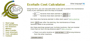
EcoSafe Cost Calculator

EcoSafe Cost Calculator

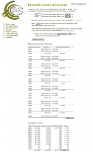
EcoSafe Cost Calculator results

EcoSafe Cost Calculator results

The Cost Calculator

The EcoSafe Cost Calculator is some of the least neatly contained and most procedurally oriented PHP code I’ve ever produced while knowing full well what I was doing. It does almost everything it does in global scope. Yet, it does it well.

The thing is designed as a dynamic web page rather than a web application. What I mean by this is that it’s simply two pages (one for English and one for Dutch) using PHP among a number of pages using SSI. In an application, it’s usual to have just one ‘view’ that is the same for all languages, but here I chose to put the different language versions in different language pages and then include everything reusable (and language-neutral) from within these files.

Most of the actual processing and calculating is done in inc/costs-functions.php. (The part about gotos is a joke. (Labeled blocks would have been quite sufficient. 😉 ))

<?php # costs-functions.php - Stuff that's includes by cost-calculator.{nl,en}.phtml
/**
 * Just remember that this code was never meant to be general purpose or anything.
 * So, relaxeeee and keep your OO-axe burried where it belongs.
 * Oh, if only PHP would support GOTO's ... Sigh ...
 */

The rest of the file is just a whole lot of processing of form data and turning it into something that can be easily traversed for display to the user. There are even the function calls without arguments doing all their work on globals. These are actually only added to make it clearer em a piece of code is doing. And—I must say—after a few years it’s still remarkably clear to me what each part of the code is doing. There’s no deep, confusing nesting structures or anything. There’s just a whole lot of very simple code.

Some simple AHAH increases form interactivity

Users of the calculator can add any number of plantings and locations. When the user decides to add a planting or a location, the onClick event triggers the execution of addExtraPlanting() or addExtraLocation(). Here’s how addExtraPlanting() looks:

function addExtraPlanting() {
  lang = document.documentElement.lang;
 
  new Ajax.Updater(
    'plantings', '/inc/planting.' + lang, {
      method: 'get',
      insertion: Insertion.Bottom
    }
  );
}

Ajax.Updater comes from the Prototype JavaScript framework.

Here’s what inc/planting.en.phtml looks like. The same file is also included in a loop to rebuild the form’s state after submitting.

<li>
  <input name="num_hectares[]" type="text" size="5" value="<?php echo $num_hectares ?>" />
 
  hectares have been planted in
 
  <select name="plant_years[]"><?php require('planting_options.php') ?></select>
 
  (<a title="Remove this planting" href="#" onclick="removePlanting(this); return false;">x</a>)
</li>

I think that I’ve gone into small enough detail by now to get to the conclusion. Also showing the contents of planting_options.php would be pushing it. Ah, well…

<?php
 
if ( !isset($this_year) ) $this_year = intval(date('Y'));
if ( !isset($plant_year) ) $plant_year = $this_year;
 
for ($i = $this_year; $i >= $this_year - 20; $i--)
  echo "<option" . ($i == $plant_year ? " selected='1'" : "") . ">$i</option>\n";

(Yesterday, I couldn’t resist the temptation of turning this into a simple file to require() instead of the function definition it was. I think it’s funny to refactor something to remove encapsulation.)

Conclusion

As is usual when looking at old code, I see many things that I’d do (even just a little) different today, but I saw a surprising number of solutions that I actually still like now that I see them back after three years. Removing some of the remaining warts probably won’t do much good besides the masturbatory satisfaction it could give me. (It’s likely that the website won’t live much longer, making such extra attention very undeserved.) But, nevertheless, I’ve enjoyed blogging about it now to recoup the whole experience and to at least look at what I’d do different now and what I learned in the meantime.

Some links

Styling XML SVN logs with CSS

My friend, Wiebe, keeps his website in Subversion. (Always keep your project files in version management or you’ll be sorry.) He used to manually track the date with the last significant change in each file (because who cares about typos, right?). But, of course, he kept forgetting to update this when he actually made such changes. So, he decided that he wanted to publish the full SVN log for each page.

The raw SVN logs are a bit raw, reason enough to try to turn it in something prettier. Luckily, there’s no need to parse the log files, because svn log has a command-line option, --xml. This option causes the log file to be printed in a simple XML format:

<?xml version="1.0"?>
<log>
<logentry revision="345">
<author>halfgaar</author>
<date>2009-05-25T10:50:07.560914Z</date>
<msg>Added very useful note to index about an awkward sentence.
</msg>
</logentry>
<!-- Snipped the rest of the logentry elements -->
</log>

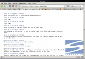
Now we can use any number of ready-to-use XML tools to process this log, but I figured that, maybe, a very simple solution could work: CSS. Cascasing Stylesheets can be used for more than just styling HTML. One of the few differences is that with non-HTML XML, there are no defaults for the CSS properties (and aren’t we always trying to discover and override the various browser-specific CSS defaults anyway?)

First, we want to add a <?xml-stylesheet?> processing instruction to the log file:

svn log --xml example_file.xhtml | sed -e '/<\?xml / a<?xml-stylesheet type="text/css" media="screen" href="/css/svn-log.css"?>'

The XML file now references the CSS file that we’re going to make:

<?xml version="1.0" encoding="UTF-8"?>
<?xml-stylesheet type="text/css" media="screen" href="svn-log.css"?>
<!-- snip -->

svn-log.css:

log {
 :;
 :('http://svn.collab.net/repos/svn/trunk/notes/logo/256-colour/subversion_logo-200x173.png');
 :;
 :;
 :;
 :;
 : 2em 204px 2em 5ex;
}
 
logentry {
 :;
 :;
 : 1em;
 :;
 :;
 : #999;
}
 
author {
 :;
}
 
date {
 :;
 : 10ex;
  /* If Firefox would support font families even when you force a font,
     I could use 'overflow: hidden' to hide everything except the date part of <date>. */
 :;
 :; 
 :;
 :;
 : 110%;
 : #7488a7;
}
 
msg {
 :;
 : pre-wrap;
 :;
}

We now have a nicely formatted log file. Other things you could do:

  • Add styles for printing (in a separate stylesheet or by using @media blocks).
  • Display the revision author instead of hiding it.

Of course, you could do all this and much more with XSLT, but that’s just all too obvious. 🙂

If you want to see the stylesheet in action, take a look at Wiebe’s website and look for a View revision log of this page link in the footer of any of his pages.

XML SVN log styled with CSS

XML SVN log styled with CSS

New theme

After upgrading to WordPress 2.5.x, I had to fall back on a stock theme because my old customization of the Sandbox theme no longer worked with the upgrade. But, then, it was time to redo my theme anyway. So here you’re looking at the first version of my new theme. I might have let it stabilize some more before putting it on-line, but who cares? My reader maybe? Let’s just hope he or she doesn’t use IE. 😉

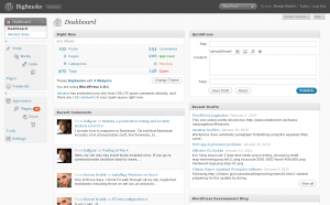
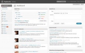
Screencap of my new WP theme Screencap of my new WP theme Screencap of my new WP theme Screencap of my new WP theme Screencap of my new WP theme

Vertical navigation

Ever since the first time that I saw a blog which featured vertical navigation instead of the typical columns, I’ve wanted to implement this for myself. Well, finally…

Site-wide elements use the complete width of the page. The page content is centered in the middle at 87.5%. The identity stuff in the header and the navigation in the footer sits against a back blackground while the content area has the proven black on white for easy reading. I hope that the strong color-contrast as well as the clear difference in with between site-wide elements and page content makes it easy to keep focused on either reading or navigating without distractions.

… and a talkative footer

With this theme, I didn’t want another footer which consist of the odd logo and some loose copyright statements. I wanted a footer which you can actually read, even understand. And who cares if it takes up a little space? It’s at the bottom of the page.

Related posts

I’ve written an (unpublished, unpolished) plug-in which can generate a list of posts that are chronologically related. Traditionally, most blogs have a next/previous post link at the top and bottom of each post. This works very well if you limit your blog to one subject (which is really a very good idea anyway), but if, like mine, your blog is a little bit messy, you could say that someone who stumbled here searching for an article about Subversion is not necessarily interested in the next post if this is a photo of my baby niece.

Hence the chronologically related posts plugin. With this plugin I can say wether I want a link to the first, previous and next post in the blog, within the same category, or matching a given number of tags. (The tag matching isn’t implemented yet, though. Also, matching on meta fields would be a kick-ass ass way to support explicit sequences.)

I put the list generated by this plug-in on top of a blue background besides the various context links of the post.

Issues left

I hope to have the first major revision of my theme ready soon. Here’s a list of some issues that I might address:

  • The CSS renders a bit psychedelically in MSIE 6 (only version I tested) at the moment. Sigh… Let’s just hope that IE 7 will give better results. Then I’ll gladly drop the IE 6 support.
  • When viewing a category, the tag cloud in the navigation panel at the bottom only shows tags for that category. This has to do with the use with me calling the st_tag_cloud() from within the category template.
  • Some of the elements that I just showed to you don’t really look that good and most elements that I didn’t can be said to be … hideously ugly. 😕 Some highlights: the header (should really be a few cool images), the comment form, and the Next/Previous Page links.

Comment!

I’d almost forget all about the clean, new look of the comment list. And, if you register a Gravatar, your comments will be accompanied by your avatar. Try it. Please!

« Older posts

© 2024 BigSmoke

Theme by Anders NorenUp ↑