Stichting EcoSafe is a Dutch foundation for the safe-keeping of the funds that are necessary for the maintenance of hardwood plantations. In July of 2006, together with Johan Ockels, I created a website for the Foundation. Johan was responsible for the organization of the whole process. This went very smooth and the website ended up being an emblem of simplicity and clarity. That’s why I wanted to blog a bit about it now, even though there are a few things that I’d probably end up doing different if I were to start from scratch. [There’s actually a disturbing number of things for which this is true, I’m coming to notice.]
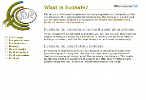 The Welcome page of the EcoSafe website |
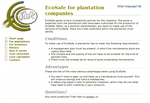 EcoSafe page for plantations |
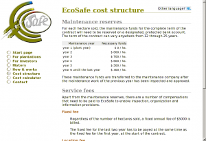 EcoSafe cost structure |
File structure
Like with most websites, I started with creating an SVN repo so that I wouldn’t have to be afraid of ever losing anything.
The file structure was pretty standard:
- a css dir for stylesheets;
- img for images;
- inc for shared PHP and mod_include stuff and for AJAX partials;
- jot for to-do’s and other notes;
- and js for JavaScript files and libraries.
Possible file structure improvements
If I were to redesign this file structure, I’d collapse css, img and js into one directory called layout, because these are typically things that require the same robots.txt and caching policy. Also, it is meaningless to organize things by file extension. If you want to sort something by file extension, use ls -X
(or ls --sort=extension
if you’re on GNU).
Server-side includes
The site would be so simple that I felt that any type of CMS or content transformation would be completely unnecessary. Instead, I decided to rely on Apache’s mod_include and just use a few partials for repeating page elements such as the left sidebar containing the logo and the menu.
Also, because I didn’t need to transform the HTML files, I decided I could use good ol’ HTML 4 instead of XHTML 1 (which I’d have to send to the browser with the wrong mime-type anyway).
This is the HTML for contact.nl.shtml:
<!DOCTYPE html PUBLIC "-//W3C//DTD HTML 4.01//EN" "http://www.w3.org/TR/html4/loose.dtd">

<html lang="en">
  <head>
    <title>Contact EcoSafe</title>

    <meta http-equiv="Content-Type" content="text/html; charset=UTF-8" />

    <link rel="stylesheet" type="text/css" href="/css/style.css"></link>
  </head>

  <body>
    <!--#include virtual="/inc/left-side.en.html"-->

    <!--#include virtual="/inc/alt-lang.phtml"-->

    <div id="content">
      <h1>Contact</h1>

      <p>Your email to EcoSafe kan be sent to the following address:
      <a href="mailto:service@stichting-ecosafe.org">service@stichting-ecosafe.org</a>.
      Or, alternatively, you can fax us at +31 50 - 309 66 58.</p>

      <h2>About this website</h2>

      <p>For comments and/or suggestions concerning this website,
      you can direct an email message at:
      <a href="mailto:webmaster@stichting-ecosafe.org">webmaster@stichting-ecosafe.org</a>.</p>
    </div>
  </body>
</html>

Alternative language selection
I use <!--#include virtual--> to include the repeating parts. <!--#include virtual--> has several advantages over <!--#include file--> in that it allows for content-negotiation, execution of dynamic content etc., but here the only place were it holds an advantage is in the inclusion of /inc/alt-lang.phtml. alt-lang.phtml is a messy PHP script that figures out which language variants of a page are available and displays a selection of alternative language versions (variants with a language different from the current).
SSI and caching
Without the XBitHack directive set to full, all content handled by mod_include is sent without a Last-Modified header. However, I don’t want to use XBitHack at all, because I don’t want just any executable file to be handled by mod_include; that just too much of a … hack.
If I were to do something similar now, I’d use some kind of (sed) substitution to pre-process the includes locally so that more of what I end up uploading is simple static content. The dynamic part of the included PHP script, I would simply replace with JavaScript.
Visual design
As you can see in the HTML example, there’s hardly anything layout oriented in the HTML source. This is good, and means that I have to touch only the CSS for most minor and major lay-out modifications. (It is a pipe-dream to think that you only need to change the CSS to make the same HTML page look however you want as long as that HTML is rich enough in meaning, but for a site with pages of such simple structure, it’s a dream that comes pretty close to reality.)
I’m not much of a designer, but I think design is overrated anyway. Actually, I think that most website suffer from too much design.

The EcoSafe logo
To start the design, I got a logo made by Huite Zijlstra. Because the logo was pretty big and didn’t look good scaled down, I decided to put it at the left of the content area instead of at the top. This would still leave enough room for the menu (which actually takes less space horizontally than the logo).
Colors
For the color scheme, I just picked a few colors from the logo. As always, the base of the scheme would be black text on a white background for maximum readability. The print version hardly uses any colors.
@media screen {
body            {:;  }
*               {:;             }
a:link          {: #585;              }
h1              {: #880;              }
h2              {: #888;              }
strong          {: #a62;              }
#menu li a      {: #660;              }
}
Underlines
I wanted an underline below the level 1 and 2 headings. Because I didn’t like the effect of text-decoration:underline (too thick for <h2>s, too dark for <h1>s and different from browser to browser) and because border-bottom was set too far from the text, I made two simple PNG images that I could repeat-x along the bottom edge.
@media screen {
h1 {:('/img/h1-border-bottom.png'); }
h2 {:('/img/hx-border-bottom.png'); }
}
The menu is very simple. The markup is part of inc/left-side.en.html for the English version and inc/left-side.nl.html for the Dutch version:
cat inc/left-side.en.html
<div id="left" lang="en">
  <a class="logo" href="/index.en"><img class="logo" alt="[Logo]" src="/img/logo.jpg"></img></a>

  <ul id="menu" class="menu">
    <li><a href="/index.en" rel="start">Start page</a></li>
    <li><a href="/plantations.en">For plantations</a></li>
    <li><a href="/investors.en">For investors</a></li>
    <li><a href="/history.en">History</a></li>
    <!--<li><a href="/goals">Goals</a></li>-->
    <li><a href="/methods.en">How it works</a></li>
    <li><a href="/cost-structure.en">Cost structure</a></li>
    <li><a href="/cost-calculator.en">Cost calculator</a></li>
    <!--<li><a href="/clients.en">Clients</a></li>-->
    <li><a href="/contact.en">Contact</a></li>
  </ul>
</div>

<script type="text/javascript" src="/js/menu.js"></script>

The EcoSafe menu (in English)
As is customary, I started by removing all the default list styles and made the anchors behave as block-level elements. I used the big O from the logo for bullets in the list (using background-image instead of list-style-image because the latter gives unpredictable cross-browser results and doesn’t make the bullet clickable).
#menu {
 : 2em;
 : 2em;
 :;
 : 0;
}

#menu li {
 : 0;
}

#menu li a {
 :;
 :('/img/o-21x16.png');
 :;
 :;
 : 30px;
 :;
 :;
 :;
 : #660;
}

#menu li a:hover,
#menu li.active a {
 :('/img/oSafe-21x16.png');
}

#menu a:hover {
 : #787800;
}
JavaScript menu item activation
To add the active class to the currently active list item (<li>), I used a client-side solution using JavaScript. After all, it’s proper use of JavaScript to enhance your user interface with it (as long as, as many would say, it isn’t required for the UI to function (as it is in the Cost Calculator)).
// menu.js

var menu = document.getElementById('menu');
var anchors = menu.getElementsByTagName('a');
var locationHref = window.location.pathname.toString();

for (i = anchors.length - 1; i >= 0; i--) {
  a = anchors[i];
  aHref = a.href;

  // Does this menu item link to the current page?
  // We find out by looking if the window location contains the URL in the anchor
  // or the other way arround. The reason to look at both is content-negotiation.
  // It's also true if the location is just '/' and we're looking at the anchor of
  // the 'start' page.
  if ( (locationHref === '/' && a.rel === 'start') ||
       (locationHref !== '/' && ( locationHref.indexOf(aHref) !== -1 ||
                                  aHref.indexOf(locationHref) !== -1 ) ) ) {
    a.parentNode.className = 'active';
    break;
  }
}
I actually just fixed a long-standing bug that was caused by me not being able to fully rely on HTTP language negotiation for the selection of the appropriate language variant, which made me change all links from being language-neutral to including the language in the link target (e.g.: http:///history became http:///history.en and http:///history.nl), the problem with this being that, instead of being able to link to link to http:/// (http://www.stichting-ecosafe.org/), I had to link to http:///index.en or http:///index.nl, making it more difficult to detect the active anchor if we’re requesting the home page through http:/// instead of on of its language-specific URLs.
The JavaScript rested on the assumption that by reverse iterating through all the anchors in the menu and thus processing the link to http:/// as last, I’d know that I had struck the home page and wouldn’t need to worry that any of the links contain a slash. (I don’t know if I intended it to work this way, but it sure seems to me now that the only way this could ever have worked was as an apparent side-effect of the looping order; the SVN logs seem to agree.)
I could have solved this by redirecting all requests for http:/// to the appropriate variant. Maybe I should have (to avoid duplicate content). Instead I chose to add a rel="start" attribute to the links to the home page, as can be deduced from the JavaScript above. (To resolve the duplicate content issue, I could also add a canonical link to the header of the two language variants.)
Anyway, all this brings me to the messy subject of content negotiation.
Content and language negotiation
The EcoSafe website would be bi-lingual (English and Dutch) from the onset. Initially, I wanted to use language negotiation to the extend of having completely language-neutral URLs. For example: http:///cost-calculator
instead of http:///cost-calculator.en
and http:///cost-calculator.nl
. In the end, you can make this work properly in the browser with the help of a cookie, but it’s still a pipe-dream because nothing else will work if you do not also offer another navigational path to the different variants. Maybe, we’ll revisit this topic for a later experiment.
Content-type negotiation is almost effortless with Apache thanks to mod_negotiation. If, like me, you despise to have .html, .htm, .xhtml, .phtml, .pxhtml. .sxhtml, .php, .xml in your URL (I actually used all of these at some time or other), you only have to make sure that MultiViews is in your options.
I’ve configured SSI by means of the following instead of a “magic mime-type”:
AddType         text/html       .shtml
AddHandler      server-parsed   .shtml
AddCharset      UTF-8           .shtml
AddOutputFilter Includes        .shtml
For PHP I couldn’t do the same because my web host was still at Apache 1.3. Otherwise, the following should have worked equally well for PHP:
# This doesn't work with Apache 1.3
AddType        text/html       .phtml
AddHandler     php-script      .phtml
AddCharset     UTF-8           .phtml
Configuring language priority is easy with Apache:
Integrating PHP and SSI
The integration of PHP with all the weirdness that I had configured and created around SSI took some figuring out. Luckily, PHP offers a virtual() function that works roughly the same as mod_include's <!--#include virtual-->. Here’s an example:
<body>
  <?php virtual('/inc/left-side.en.html'); ?>
  <?php $uri = '/cost-calculator.en.phtml'; include('inc/alt-lang.phtml'); ?>
In retrospect, it’s pretty much bullshit to use it. I could have just as well require()d the partials (which I actually did for the alternate language selection), but I probably started out using virtual on a more generic URL without language and content-type selection in it.
406 handling
Because I deployed on Apache 1.3 and the ForceLanguagePriority directive was only introduced with Apache 2.0.30, I had to write an ugly hack to avoid visitors getting 406 errors. To that end, I added a 406 handler to my .htaccess file:
LanguagePriority en nl
ForceLanguagePriority Prefer Fallback # This doesn't work with 1.3

ErrorDocument 406 /error-406.php # Luckily, this does
error-406.php is a PHP file that figures out the available variants based on $_SERVER['REQUEST_URI']. Then, it simply picks the first one (which works because, accidentally, that’s the one I’ve given priority using the LanguagePriority directive as well), outputs a 200 OK header instead of the 406, and virtual()s the file of the variant. The code looks somewhat like this:
<?php
chdir($_SERVER['DOCUMENT_ROOT']);
$filenames = glob(basename($_SERVER['REQUEST_URI']) . ".*");

$filename = $filenames[0];

apache_setenv('DOCUMENT_URI', "/$filename");

header('HTTP/1.1 200 OK');
virtual("$filename");
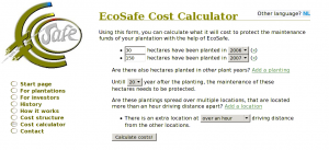
EcoSafe Cost Calculator
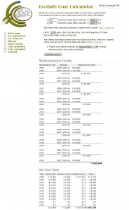
EcoSafe Cost Calculator results
The Cost Calculator
The EcoSafe Cost Calculator is some of the least neatly contained and most procedurally oriented PHP code I’ve ever produced while knowing full well what I was doing. It does almost everything it does in global scope. Yet, it does it well.
The thing is designed as a dynamic web page rather than a web application. What I mean by this is that it’s simply two pages (one for English and one for Dutch) using PHP among a number of pages using SSI. In an application, it’s usual to have just one ‘view’ that is the same for all languages, but here I chose to put the different language versions in different language pages and then include everything reusable (and language-neutral) from within these files.
Most of the actual processing and calculating is done in inc/costs-functions.php. (The part about gotos is a joke. (Labeled blocks would have been quite sufficient. 😉 ))
<?php # costs-functions.php - Stuff that's includes by cost-calculator.{nl,en}.phtml
/**
 * Just remember that this code was never meant to be general purpose or anything.
 * So, relaxeeee and keep your OO-axe burried where it belongs.
 * Oh, if only PHP would support GOTO's ... Sigh ...
 */
The rest of the file is just a whole lot of processing of form data and turning it into something that can be easily traversed for display to the user. There are even the function calls without arguments doing all their work on globals. These are actually only added to make it clearer em a piece of code is doing. And—I must say—after a few years it’s still remarkably clear to me what each part of the code is doing. There’s no deep, confusing nesting structures or anything. There’s just a whole lot of very simple code.
Some simple AHAH increases form interactivity
Users of the calculator can add any number of plantings and locations. When the user decides to add a planting or a location, the onClick event triggers the execution of addExtraPlanting() or addExtraLocation(). Here’s how addExtraPlanting() looks:
function addExtraPlanting() {
  lang = document.documentElement.lang;

  new Ajax.Updater(
    'plantings', '/inc/planting.' + lang, {
      method: 'get',
      insertion: Insertion.Bottom
    }
  );
}
Ajax.Updater comes from the Prototype JavaScript framework.
Here’s what inc/planting.en.phtml looks like. The same file is also included in a loop to rebuild the form’s state after submitting.
<li>
  <input name="num_hectares[]" type="text" size="5" value="<?php echo $num_hectares ?>" />

  hectares have been planted in

  <select name="plant_years[]"><?php require('planting_options.php') ?></select>

  (<a title="Remove this planting" href="#" onclick="removePlanting(this); return false;">x</a>)
</li>
I think that I’ve gone into small enough detail by now to get to the conclusion. Also showing the contents of planting_options.php would be pushing it. Ah, well…
<?php

if ( !isset($this_year) ) $this_year = intval(date('Y'));
if ( !isset($plant_year) ) $plant_year = $this_year;

for ($i = $this_year; $i >= $this_year - 20; $i--)
  echo "<option" . ($i == $plant_year ? " selected='1'" : "") . ">$i</option>\n";
(Yesterday, I couldn’t resist the temptation of turning this into a simple file to require() instead of the function definition it was. I think it’s funny to refactor something to remove encapsulation.)
Conclusion
As is usual when looking at old code, I see many things that I’d do (even just a little) different today, but I saw a surprising number of solutions that I actually still like now that I see them back after three years. Removing some of the remaining warts probably won’t do much good besides the masturbatory satisfaction it could give me. (It’s likely that the website won’t live much longer, making such extra attention very undeserved.) But, nevertheless, I’ve enjoyed blogging about it now to recoup the whole experience and to at least look at what I’d do different now and what I learned in the meantime.
Some links


Recent Comments