For a decade and a half, my uncle had been maintaining the website for our vacation home in the forests of Drenthe in Dreamweaver. This worked fine, except that:
- it didn’t allow me to edit and add content and photos simultaneously;
- the website had started to look and feel dated;
- it wasn’t mobile-ready; and
- all this was affecting its ranking in Google.
That’s why I had been having a new WordPress website in the pipeline since forever. However, in true 80/20 fashion, I was postponing the final steps of copying over the last bits of content and the training of my uncle to edit the website in WordPress instead of in Dreamweaver.
Why WordPress?
The last few websites I built I built myself from scratch, like in the good old days, using a simple static site generation pipeline (basically a fancy Makefile). The reasoning is that comments are too much hassle to moderate anyway, and comments and trackbacks are what WordPress offered me. Apart from that I very much prefer authoring in vim.
But that’s me. Most people, my uncle included, are way more comfortable with WYSIWYG editors—in other words: WordPress its Gutenberg editor.
A mature developer has to be able to sidestep his preferences to deliver something that’s best for the “customer”. (Indeed this post will be me bragging of how mature a developer I am. I do turn 40 tomorrow after all.)
My main “design” goal was that I didn’t want to change too much at once. The site structure and site content had to remain mostly identical, so that we would have fewer points of discussion to surmount before going live.
At the same time, I did want to clean up the content and the formatting. The old website had a distinct lack of bullets, formal headings, use of bold text, etc. (No, I don’t have pictures.) That made the text a bit difficult to parse, especially when the visitor—a potential tenant of our forest home—was just trying to find a specific piece of information at a glance.
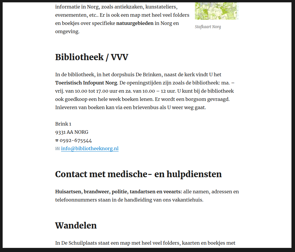
Proper formatting makes long page much more accessible.
The new website is not fancy. The theme is just one of WordPress its default themes, and I ended up not even using a graphical header to get the first version online. Important to me is that I can now easily add blog posts (like about a pretty yellow flower that I got to grow there abundantly). Also, whenever now I want to edit some text in one of the informational pages, I can.
The “page with booking information and booking availability gave me the most headaches and demanded the most from my maturity. The first thing to swipe off the table was the use of any type of booking plugin. This turned out to be the most important decision (and a very good call!). The old website (with light-yellow background) had one of those old-fashioned tables with big-ridged borders around every cell. I wanted to at least make this table look good and modern.
I gave the booking periods table a sticky header. That was something at least. What I did not do was giving the individual cells a border. But, as much as he tried liking it, my uncle hated that incarnation of the table. So I put back in some cell borders, which I had already done in the print CSS version.
Then there was the issue that my uncle had gotten used to printing out the booking schedule, and it now spanned a number of pages. Thus I did a lot of tinkering in the print CSS to make it all fit (and to make the table header repeat, just in case). And it turned that both cleaning ladies didn’t like the spacious table layout on the screen either. I had altogether forgot about them as consumers of the table, focusing instead on potential tenants. More squeezing followed, until everybody was happy, and I was … relieved.
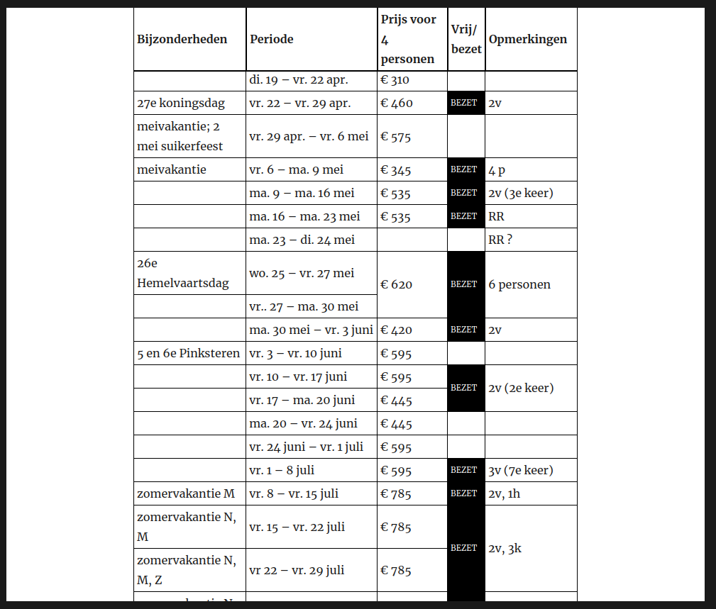
The booking schedule of our vacation home in Norg, Drenthe, the Netherlands.
It deserves mentioning that I did all these CSS within WordPress its theme customizer. Normally, I would have preferred to use a child theme for this, but it felt to early to start a child-theme, as long as I haven’t fully committed to a particular parent theme. Also, the CSS for that booking schedule table is some of the worst you might have seen. After all, the HTML is not semantic at all. It’s not like I’m going to train my uncle to specify class names on each cell. Without proper classification, I had to use implicit classification, ending up with selectors such as the td:nth-child(4):not([colspan]):not(:empty) selector that I use to make the background of occupied periods black, but only if they are not some special multi-column note. To scare the CSS wizards out there, here’s the current CSS for the table:
@media screen {
table.wp-block-advgb-table.advgb-table-frontend {
	border-width: 0;
	border-spacing: 0;
	border-collapse: separate;
	table-layout: auto;
}
.wp-block-advgb-table > thead > tr {
	position: sticky;
	top: 0;
}
.wp-block-advgb-table > thead > tr > th {
	background-color: white;
	box-sizing: border-box;
	border-top: 1px solid black;
	border-left: none;
	border-right: 1px solid black;
	border-bottom: 2px solid black;
	padding: 2px 4px;
}
.wp-block-advgb-table > thead > tr > th {
	border-left: 1px solid black;
}
.wp-block-advgb-table > tbody > tr > td {
  border-top: none;
	border-left: none;
	border-right: 1px solid black;
	border-bottom: 1px solid black;
	padding: 2px 4px;
}
.wp-block-advgb-table > tbody > tr > td:first-child {
  border-left: 1px solid black;
}
.wp-block-advgb-table > tbody > tr > td:nth-child(4):not([colspan]) {
	width: 2em;
	font-size: 70%;
}
	.wp-block-advgb-table > tbody > tr > td:nth-child(4):not([colspan]):not(:empty) {
		background-color: black;
		color: white;
	}
.wp-block-advgb-table > tbody > tr > td[rowspan] {
}
}
@media screen and (max-width: 1000px) {
	table.wp-block-advgb-table.advgb-table-frontend {
		position: relative;
		left: -7.6923%;
		max-width: none;
	  font-size: 70%;
	}
	.wp-block-advgb-table > thead > tr > th, .wp-block-advgb-table > tbody > tr > td {
		padding: 0px 1px;
	}
	.wp-block-advgb-table > thead > tr > th {
		overflow-wrap: break-word;
	}
	.wp-block-advgb-table > thead > tr > th:nth-child(3) {
		font-size: 0; /* ugly hack to hide regular text. */
	}
	.wp-block-advgb-table > thead > tr > th:nth-child(3):after {
		content: 'Prijs';
		font-size: 12px; /* ugly override because percentage would be percentage of 0. */
	}
	.wp-block-advgb-table > thead > tr > th:nth-child(4) {
		font-size: 0; /* ugly hack to hide regular text. */
	}
	.wp-block-advgb-table > thead > tr > th:nth-child(4):after {
		content: 'Vrij?';
		font-size: 12px; /* ugly override because percentage would be percentage of 0. */
	}
	.wp-block-advgb-table > tbody > tr > td:first-child {
		min-width: 8ch;
		max-width: 12ch;
	}
	.wp-block-advgb-table > tbody > tr > td:nth-child(2) {
		word-spacing: -.2ch;
		min-width: 15ch;
		max-width: 20ch;
	}
}
@media screen and (min-width: 1001px) {	 .wp-block-advgb-table > thead > tr {
		top: 21px;  /* Space from the theme that somehow has a weird z-indexy effect. */
	}
	body.admin-bar .wp-block-advgb-table > thead > tr {
		top: calc(31px + 21px);
	}
	.wp-block-advgb-table > tbody > tr > td:nth-child(2) {
		white-space: nowrap;
		max-width: 20em;
  }
}
/* filter bypass hack */@media print {
  .wp-block-advgb-table.advgb-table-frontend {
		width: 100%;
	  border: 1pt solid black important!;
	  border-spacing: 0;
		border-collapse: collapse;
		font-size: 8pt;
		table-layout: auto;
  }
	.wp-block-advgb-table > thead > tr > th {
		border: 2pt solid black !important;
		padding: 2pt 4pt;
	}
	table.wp-block-advgb-table > tbody > tr > td {
		border: 1pt solid black !important;
		padding: 1pt 4pt;
	}
	.wp-block-advgb-table > tbody > tr > td:first-child {
		white-space: nowrap;
	}
	.wp-block-advgb-table > thead > tr > th:nth-child(3) {
		font-size: 0; /* ugly hack to hide regular text. */
	}
	.wp-block-advgb-table > thead > tr > th:nth-child(3):after {
		content: 'Prijs';
		font-size: 12px; /* ugly override because percentage would be percentage of 0. */
	}
	.wp-block-advgb-table > thead > tr > th:nth-child(4) {
		font-size: 0; /* ugly hack to hide regular text. */
	}
	.wp-block-advgb-table > thead > tr > th:nth-child(4):after {
		content: 'Vrij?';
		font-size: 12px; /* ugly override because percentage would be percentage of 0. */
	}
	.wp-block-advgb-table > tbody > tr > td:nth-child(3) {
		max-width: 8ch;
	}
}
Which reminds me of something quite terrible about Gutenberg. Its table block doesn’t support merged cells, like—what the fuck?—why is this not considered a priority? Fucking hipsters and their having to reinvent the wheel every year and taking years to put all the spokes back into place. The “solution” was to install a plugin—PublishPress Blocks—that among other blocks that I don’t need (and could thankfully turn off) an “Advanced Table Block” that does support cell merging, but with such nasty bugs that it’s really hard to train my uncle to work around them. Sadly, there has been no activity yet to fix either one of them.
That’s it. This project didn’t make me more of a WordPress fan. (I’m no hater either. I think that WordPress its UX, specifically, has long been excellent, and exemplary in its non-nerdiness, quite the contrast with other popular open source CMSs.) But I chose the right tool for the right job and managed to make myself and the other “customers” happy. Since the go-live, I’ve added a number of blog posts already, and it’s great fun to now be able to contribute to this website’s content.
Did this get you interested? Feel free to book a stay in our idyllic vacation home in Norg, Drenthe, the Netherlands


Recent Comments