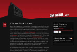
While investigating fragment identifiers and hashbangs for payformystay.com quite a while back, I came across this article by Dan Web, when I noticed that I really, really liked the design of danwebb.net:
It’s not often that I find myself liking a dark design, but this one’s much nicer and even more readable than most light designs. The contrast is good. It’s clean. It’s simple. I just really like it.
I’m finishing this post today, because I just noticed that a secret project that I’m currently working on might have its design unconsciously inspired by this or something similar.

Recent Comments