Often, I come across websites that have a beautiful design or even just interesting design elements. Instead of continuing to spread these URLs all over my $HOME and my (del.icio.us) bookmarks, I thought I’d start adding them here. Today, I want to start with an entry from ~/jot/exemplary-web-design.txt: Qt
I’ve actually programmed in Qt a bit in a dark past. Even though I’m not too fond of it (or C++ in general), it’s a very decent toolkit as far as toolkits go. What’s really great, though, is their website (now at qt.nokia.com).
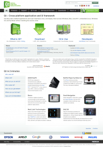
The website logo with integrated slogan is perfectly clear. At the top right, there’s a nice and clear Google Custom Search, below which there’s a language switcher and a cleverly placed contact link.
Then comes the horizontal navigation bar with the tabs. It clearly shows which section you’re in. The homepage has an icon instead of a text, which is a nice touch. Also, the Developer Zone tab has a distinct layout with a big icon. I like this; it makes it clear that Nokia (formerly Trolltech) appreciates its developers (insert Ballmer monkey dance here).
The content area starts with a clear h1 heading text and a one-sentence-introductory paragraph. Then, four of the sections are highlighted again, with a short summation below of what can be expected in that section.
Below that, is another visually distinct area which highlights the latest news-items, events and other recently featured items.
Testimonies by two high-profile projects are used to interrupt the flow of information at this point, before Qt in 2 minutes is presented. Qt in 2 minutes is clearly made to quickly help people who are new to Qt along to the right information. This takes up 7 headings and they use JavaScript to show only one subsection at the time, allowing you to switch subsection by clicking the headings in the menu at the left.
At the end of the content area, there’s a subtle reference to the KDE project and a list of the biggest-name customer logos.
The content area is closed by another horizontal navigation bar. This one has a link to the sitemap, an accessibility statement, and to the contact page again. At the right, it also contains a Nokia logo.
Then in almost invisible print (because it isn’t interesting), there’s the copyright statement and a link to the privacy policy.

Recent Comments